
Kelly Santos Logo.

Bee Protectors Website
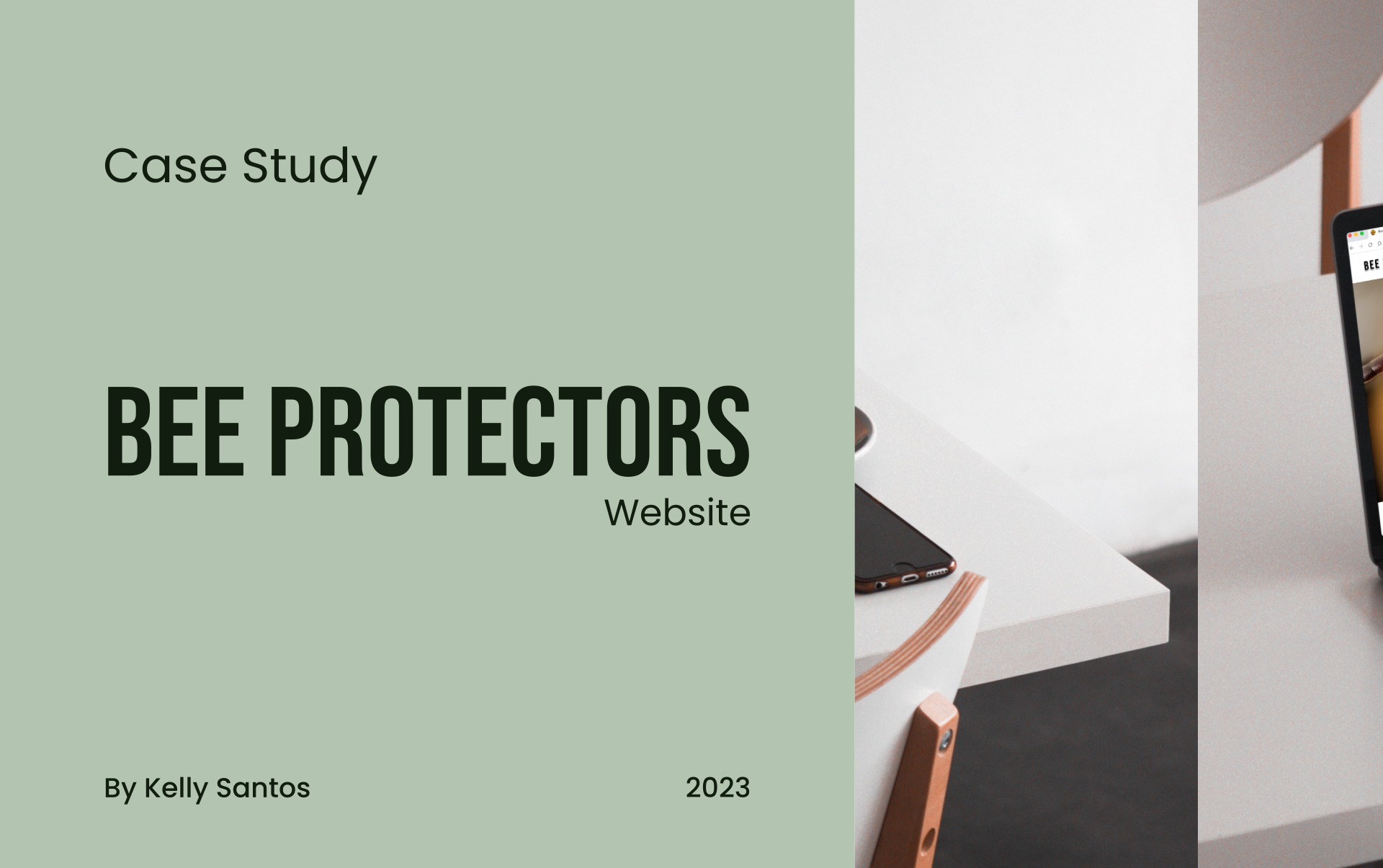
Case study cover, split in two. The left side is sage green with the text: Case Study, Bee Protectors Website, By Kelly Santos, 2023. The right side shows a laptop screen displaying the website homepage with a close-up bee photo and the text 'Bees Need Your Help!' and 'Why bees are in danger?'

Case Study | Kelly Santos | 2023

This case study details the step-by-step development process of Bee Protectors Website, using the Design Thinking methodology, which resulted in a website to inspire, educate, and empower individuals in bee protection.

Case study cover, split in two. The left side is sage green with the text: Case Study, Bee Protectors Website, By Kelly Santos, 2023. The right side shows a laptop screen displaying the website homepage with a close-up bee photo and the text 'Bees Need Your Help!' and 'Why bees are in danger?'

Project overview

About the project

This project aims to develop a website that raises public awareness about the crucial role bees play in our ecosystem and the alarming consequences of their decline, while ultimately strengthening community connections.

Key objectives

  • Provide visually engaging and user-friendly access to conservation resources (guides, articles, and educational materials)
  • Provide clear opportunities to engage individuals and motivate them to take action for bee conservation.

Project Details

Scope of Work

  • Apply a Human-Centred Design (HCD) approach, utilising the Design Thinking methodology to drive the project from discovery through to execution.
  • Conduct user research and analysis to understand user needs, pain points, behaviours, and refining the problem statement.
  • Design user flows, wireframes, prototypes, and animations.
  • Test the app to ensure usability and iterate the designs based on feedback.

Methodology

Design Thinking is a human-centred methodology that uses a five-stage process, Empathise, Define, Ideate, Prototype, and Test, to understand users and solve problems, resulting in solutions that are desirable, feasible, and viable.

This project employed the Design Thinking methodology, guiding the process through user research, ideation, prototyping, and testing to produce the final Bee Protectors Website design.
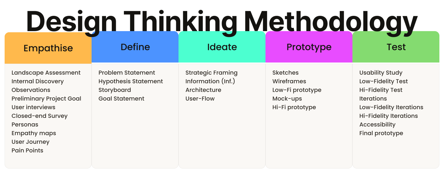

Design Thinking methodology: five stages—Empathise, Define, Ideate, Prototype, and Test.
Illustration representing diverse user perspective.

Empathise

Empathise is the first phase of the Design Thinking process, it focuses on employing a variety of tools to uncover and understand the feelings, thoughts, and experiences of users, gathering data and insights to guide the design solutions.

To ensure a deep understanding of users and their experiences, ten key methods were utilised to gather and structure data:

  • Organisational Assessment
    • Internal Discovery
    • Observations
    • Preliminary Project Goal
  • User interviews
  • Closed-end Survey
  • Personas
  • Empathy maps
  • User journeys
  • Pain points

Organisational Assessment

An organisational assessment provides a foundational understanding of the business context, helping to gather data to identify the essential components that shape an organisation’s identity, strategy, and actions.

At this stage, the project was defined only by its core topic: the development of a website for the Bee Protectors community.

To gain a deeper understanding of the organization’s objectives, structure, and values, an organisational assessment was conducted.

This process was supported by structured stakeholder meetings, face-to-face interviews with internal users, and direct field observations.

Internal Discovery

Stakeholders meeting internal user interviews

Six colorful, pinned sticky notes labeled: Mission?, Values?, Vision?, Goals?, Expectations?, and Community structure?—representing the key questions for this research phase.

The stakeholder meeting and, face-to-face interviews with internal users revealed strategic and cultural details about the organization by answering key questions, as listed below, which ultimately shaped the preliminary picture of its identity and the future website.

Category Details Revealed
Goal Create a website to educate the public about bees’ importance and the risks of their decline.
Expectations Amplify their bee conservation message, increasing awareness and inspiring more people to join their cause.
Community Structure Farmers, ecologists, and enthusiasts unite as volunteers, easing access to conservation resources and events.
Mission Engage individuals and motivate them to take action for bee conservation.
Vision Increase the number of initiatives and volunteers for bee conservation by 100% until 2026.
Values Collaboration, sustainability, education, and community engagement.

Observations

Observation is a method that involves systematically watching and recording behaviours, events, or phenomena. It is a qualitative research approach that allows to gather data in a natural environment, without directly interacting with participants, to better understand the user experience.

An observation session was conducted on Saturday, 28 October 2023, during a visit to the Community Centre. The visit aimed to better understand community engagement and participation in bee-related activities.

Observation Note

The community centre offered diverse activities, attracting visitors of all ages. Many were interested in bee-friendly flower planting, reflecting growing awareness of pollinator support. The atmosphere was enthusiastic and collaborative.

Insight

The community centre's diverse activities demonstrate their commitment to providing opportunities for both education and hands-on involvement in bee conservation. This approach is likely to attract a wider audience and foster a stronger sense of community.

Preliminary Project Goal

A project goal is a clear, concise statement that describes the desired outcome or result a project aims to achieve. It guides the project team, aligns stakeholders, and ensures that all efforts are focused on meeting user needs and business objectives.

The outcome of the Organisational Assessment helped shape the preliminary project goal:

Develop a website to raise public awareness about the crucial role of bees in our ecosystem and the alarming consequences of their decline. Additionally, the website must serve as an online extension of the community, providing easy access to initiatives, events, groups, and resources to engage individuals and motivate them to take action for bee conservation.

User Interviews

User interviews is a method used to gather qualitative data and insights; it involves conversations with participants to understand their thoughts, feelings, and experiences.

Semi-structured, face-to-face interviews were conducted mostly to identify the users' (general public this time) needs, motivations, and pain points related to bee conservation.

User Interviews Planning
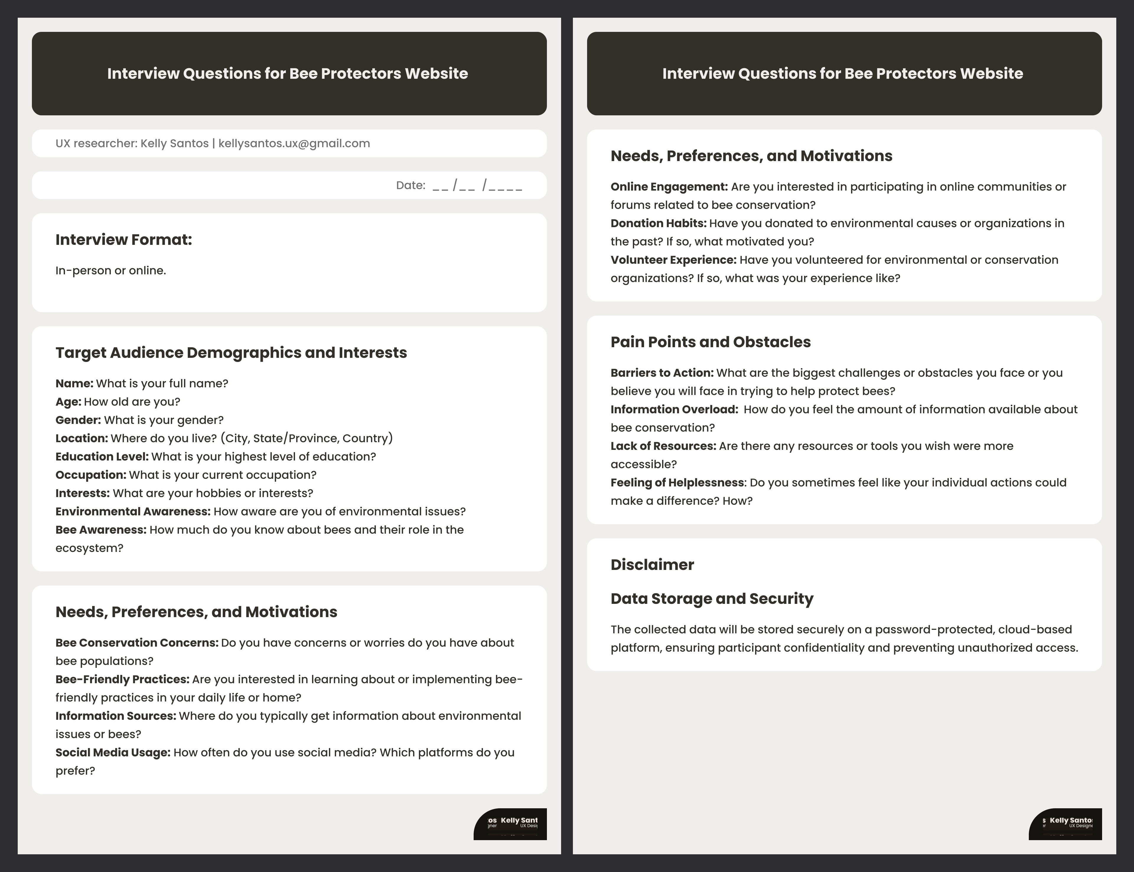
Interview Questions for Bee Protectors Website
An image showing two pages of a UX research document titled Interview Questions for Bee Protectors 
                  Website. The document is organized into several clear sections:
                  Header: Lists the UX researcher as Kelly Santos with an email address.
                  Target Audience Demographics and Interests: Questions regarding the participant's 
                  name, age, gender, location, education, occupation, interests, environmental 
                  awareness, and specific bee awareness.
                  Needs, Preferences, and Motivations: Questions about concerns for bee populations, 
                  interest in bee-friendly practices, information sources, social media usage, online 
                  engagement, donation habits, and volunteer experience.
                  Pain Points and Obstacles: Questions about barriers to action,
                  information overload, lack of resources, and feelings of helplessness 
                  regarding individual impact.
                  Disclaimer: Includes a section on Data Storage and Security, stating that data 
                  is stored securely and confidentially.
                  The design is clean and professional, using a dark brown and light grey color 
                  palette with rounded-corner content blocks. The Kelly Santos UX Designer logo appears 
                  in the bottom right corner of both pages.

User Interviews Notes

The answers were organized into categories to guide the project's development, such as Pain Points, Behaviours, Who, Awareness, Interest, Goals, Motivation, Expectations, Barriers, Preferences, and Needs.
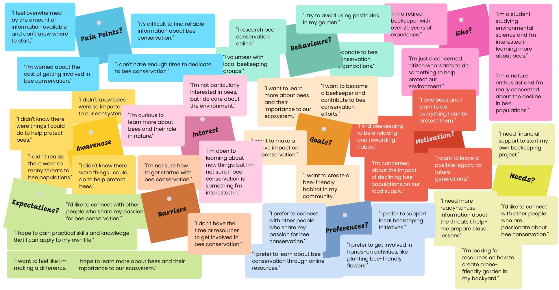
A large, comprehensive visual of clustered colourful sticky notes,
                organized into categories such as Pain Points?, Behaviours?, Who?, Awareness?, 
                Interest?, Goals?, Motivation?, Expectations?, Barriers?, Preferences?, and Needs?. 
                Each category contains multiple handwritten notes reflecting diverse user insights and 
                perspectives on bee conservation, effectively illustrating the outcome of user interviews 
                used to guide and inspire project development.

This comprehensive visual representation, using clustered, colourful sticky notes, maps the diverse user insights and perspectives on bee conservation. It serves as a valuable reference, directly guiding and inspiring the project's next developmental steps.

User Interviews Outcome

The user interview analysis successfully identified a diverse segment of target users and outlines their varying levels of bee conservation awareness and interest.

This diversity is evident in the following quote extracts:

Quote Extract Category / Analysis Implication
I didn't know there were things I could do to help protect bees. Awareness / Barriers Highlights a low level of awareness and a significant barrier to action (lack of practical knowledge).
I'm curious to learn more about bees and their role in nature. Interest / Knowledge Gap Represents a moderate level of interest and a need for foundational educational resources (the why before the how).
I'm a retired beekeeper with over 20 years of experience. Expertise / Motivation Confirms a high level of awareness and expertise, requiring advanced resources, community, or mentorship opportunities.

In summary, the project should cater to a wide spectrum of users, ranging from absolute beginners needing basic awareness and clear, easy steps, to seasoned experts looking for community, advanced knowledge, or volunteer opportunities.

Closed-Ended Survey

A closed-ended survey is a method used to collect specific qualitative or quantitative data about a determined subject, providing clarification and detail through the use of predetermined answers.

A closed-ended survey was conducted to collect data and clarify some tendencies related to bee websites.

Closed-end Survey Planning

Closed-end Survey Questions

Research Theme Interview Questions
Interests What are the users' primary interests in bees or beekeeping?
Expectations What users do find most valuable on websites about bees?
Needs What areas would users like to see expanded or improved on websites about bees?
Behaviours How often do users visit bee-related websites?
Awareness How can websites about bees better engage and inspire users to take action to support bees?

Closed-end Survey Results

The survey results are presented in the bar charts below:

What is your primary interest in bees and beekeeping?
40%
37%
20%
8%
Supporting bee conservation efforts
Learning about beekeeping as a hobby
Understanding the role of bees in the ecosystem
Other (please specify)

The survey reveals that most users are primarily interested in supporting bee conservation efforts, followed by learning beekeeping as a hobby. Educational and ecological interests are also significant, highlighting diverse motivations.

How often do you visit websites about bees?
45%
29%
15%
10%
1%
Weekly
Daily
Monthly
Occasionally
Never

Most users visit bee-related websites weekly or daily, showing strong ongoing interest. Occasional and monthly visits are less common, while very few participants never seek bee information online.

What do you find most valuable on websites about bees?
55%
20%
15%
9%
1%
Opportunities to connect with other bee enthusiasts
Practical tips for beekeepers
Informative articles and resources
Advocacy and outreach efforts
Other (please specify)

Most users value connecting with other bee enthusiasts, followed by practical tips and informative resources. Fewer prioritize advocacy or other features, highlighting the importance of community and actionable content.

What areas would you like to see expanded or improved on websites about bees?
45%
35%
11%
8%
1%
Beginner-friendly resources
Advanced beekeeping techniques
Local events and workshops
Bee health and disease information
Other (please specify)

Users most want beginner-friendly resources, but also value advanced techniques, local events, and bee health information. This highlights the need for diverse, accessible, and practical content improvements.

How can websites about bees better engage you and inspire you to take action to support bees?
42%
34%
13%
7%
4%
More interactive content, such as quizzes or games
Personalized recommendations based on your interests
Opportunities to volunteer or donate
Stronger calls to action for bee-friendly practices
Other (please specify)

Users want more interactive content, personalized recommendations, and opportunities to volunteer or donate. Stronger calls to action and engaging features can better inspire action for bee support.

Closed-end Survey Outcome

The survey revealed a user base that is passionate about conservation, values community and education, and seeks both accessible and advanced resources. To best serve this audience, bee-related websites should offer a mix of community features, practical guides, interactive content, and clear opportunities for action.

Personas

A persona is a method used to create a fictional character that represents a group with common characteristics, such as their demographics, behaviours, motivations, and goals, clearly informing the project's target users.

Four distinct personas representing our target users were identified: nature enthusiasts, retirees, busy urbanites, and educators.
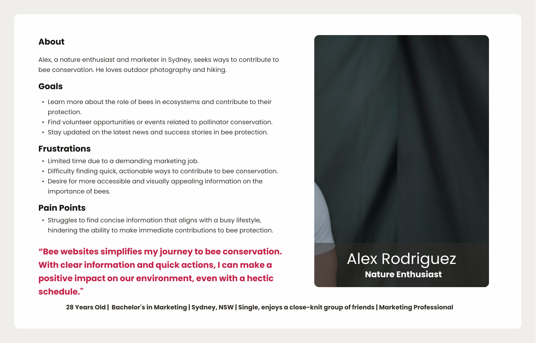
Alex's Persona (Nature Enthusiast)
Alex Rodriguez, user persona categorised as Nature Enthusiasts. 
                  The profile includes sections for About, Goals, Frustrations, and Pain Points, 
                  detailing Alex's interest in bee conservation, his desire for accessible information, 
                  and his struggle with finding concise content due to a busy schedule. A large photo 
                  of Alex, a man with dark hair and a beard, is on the right, with Alex Rodriguez and 
                  Nature Enthusiast below. His personal information at the bottom states: 28 Years Old, 
                  Bachelor's in Marketing, Sydney, NSW, Single, enjoys a close-knit group of friends, 
                  Marketing Professional.
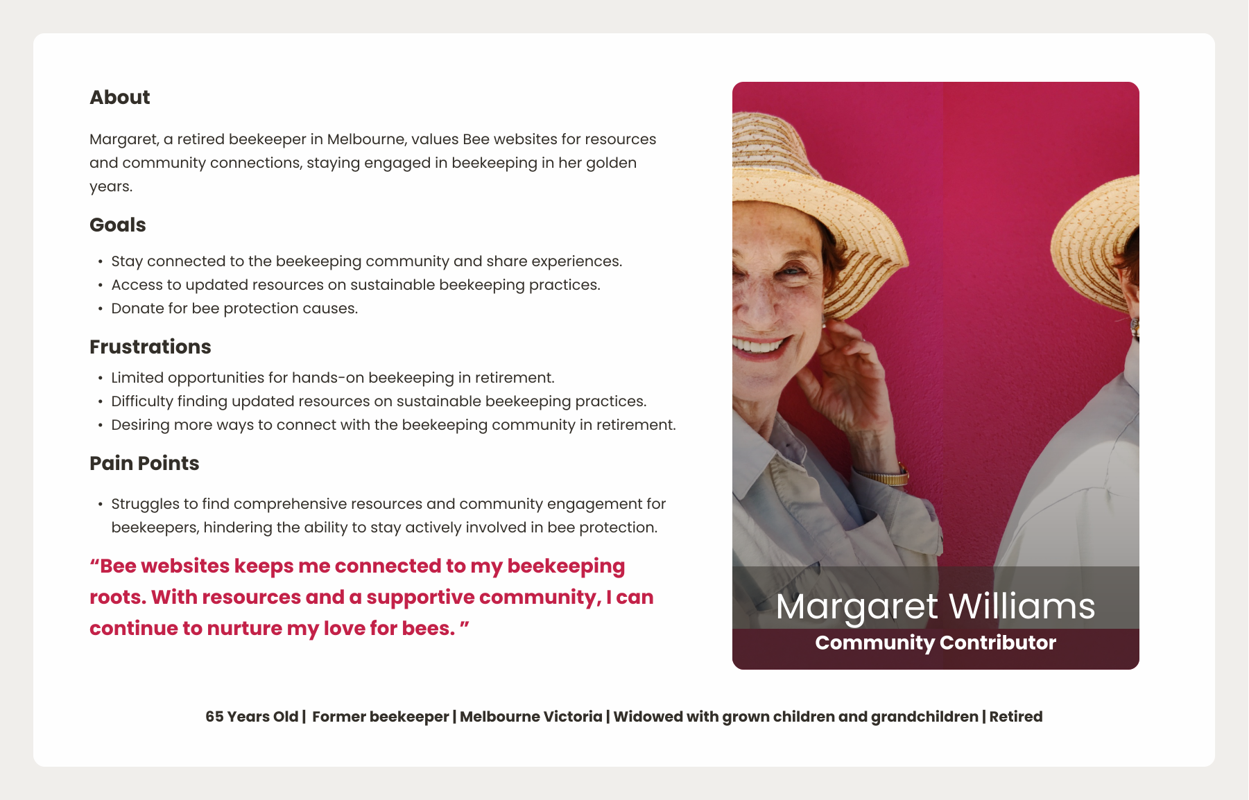
Margaret's Persona (Retiree)
Margaret Williams, user persona categorised as Retiree. 
                  The profile includes sections for About, Goals, Frustrations, and Pain Points, 
                  detailing Margaret's value of bee websites for resources and community connection as a 
                  retired beekeeper, her desire to stay connected and access updated resources, and her 
                  struggle to find comprehensive resources and community engagement. A large photo of Margaret, 
                  a mature woman wearing a beekeeper-style hat, is on the right, with Margaret Williams and 
                  Community Contributor below. Her personal information at the bottom states: 65 Years Old, 
                  Former beekeeper, Melbourne Victoria, Widowed with grown children and grandchildren, Retired.
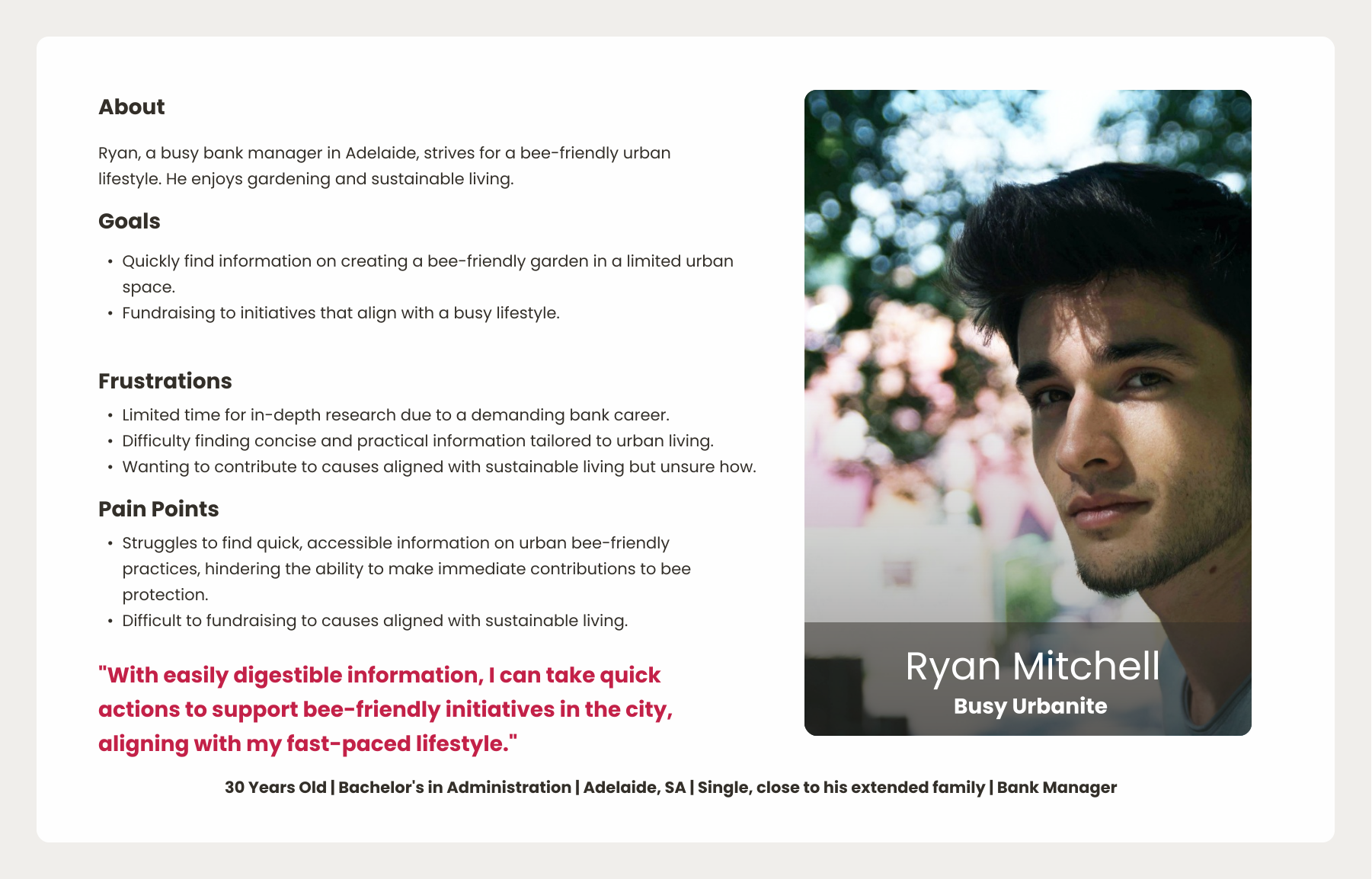
Ryan's Persona (Busy Urbanite)
Ryan Mitchell, user persona categorised as Busy Urbanite. 
                  The profile includes sections for About, Goals, Frustrations, and Pain Points, 
                  detailing Ryan's pursuit of a bee-friendly urban lifestyle, his enjoyment of gardening, 
                  and his desire to find quick, accessible information on urban bee-friendly practices. A 
                  large photo of Ryan, a young man with dark hair, is on the right, with Ryan Mitchell and 
                  Busy Urbanite below. His personal information at the bottom states: 30 Years Old, 
                  Bachelor's in Administration, Adelaide, SA, Single, close to his extended family, 
                  Bank Manager.
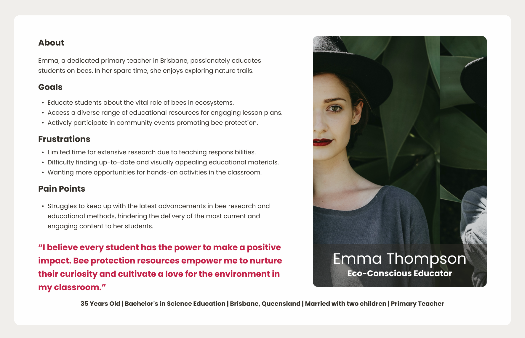
Emma's Persona (Educator)
Emma Thompson, user persona categorised as Educator. The profile includes sections 
                  for About, Goals, Frustrations, and Pain Points, detailing Emma's passion for educating 
                  students on bees, her desire for diverse educational resources, and her struggle with 
                  limited time for research and finding engaging materials. A large photo of Emma, a woman 
                  with dark hair and a black hat, is on the right, with Emma Thompson and Eco-Conscious 
                  Educator below. Her personal information at the bottom states: 35 Years Old, Bachelor's 
                  in Science Education, Brisbane, Queensland, Married with two children, Primary Teacher.

Personas Outcome

The outcome of this phase informed the goals, frustration and pain points shared across all personas:

  • Shared goals: Access bee material resources, fundraise, donate, learn about bees, get involved in conservation, and make a positive impact.
  • Common frustrations: Lack of time, difficulty finding reliable information, feeling overwhelmed and limited opportunity for hands-on activities.
  • Pain points: Difficulty accessing bee educational methods, lack of urban bee-friendly material on bees, lack of concise information about how to contribute to the cause and lack of hands-on activities.

Empathy Maps

An empathy map is a method that visually explores a user’s sayings, thoughts, actions, and feelings to build a shared understanding of a specific group of people, highlighting their unique needs and pain points.

The following four empathy maps reveal the personas' most common feelings, thoughts, actions, and words.
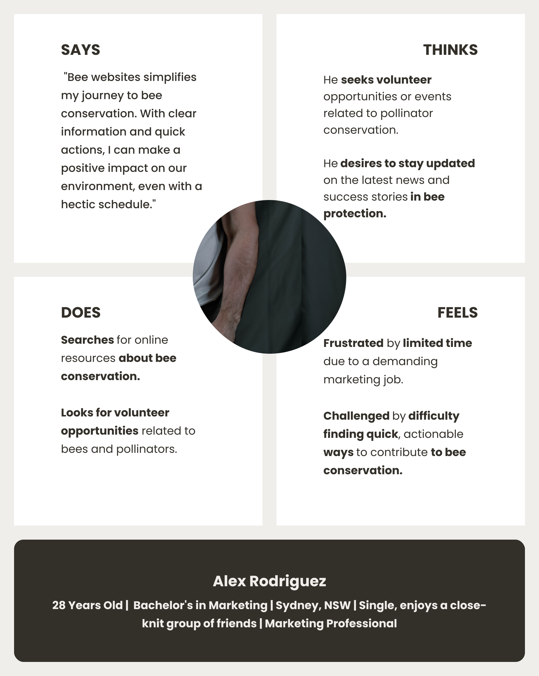
Alex's Empathy Map
An empathy map for Alex Rodriguez, a user persona. 
                    The map is divided into four quadrants: Says, Thinks, Does, and Feels. 
                    The Says quadrant includes quotes about wanting to help bees. The Thinks 
                    quadrant describes his desire for easily accessible information. The Does 
                    quadrant mentions his online searches and community center visits. The Feels 
                    quadrant highlights his confusion and frustration. A headshot of Alex, a man 
                    with dark hair and a beard, is centred above the quadrants. Below the map, 
                    his name is displayed along with his personal information: 28 Years Old, 
                    Bachelor's in Marketing, Sydney, NSW, Single, enjoys a close-knit group of 
                    friends, Marketing Professional.
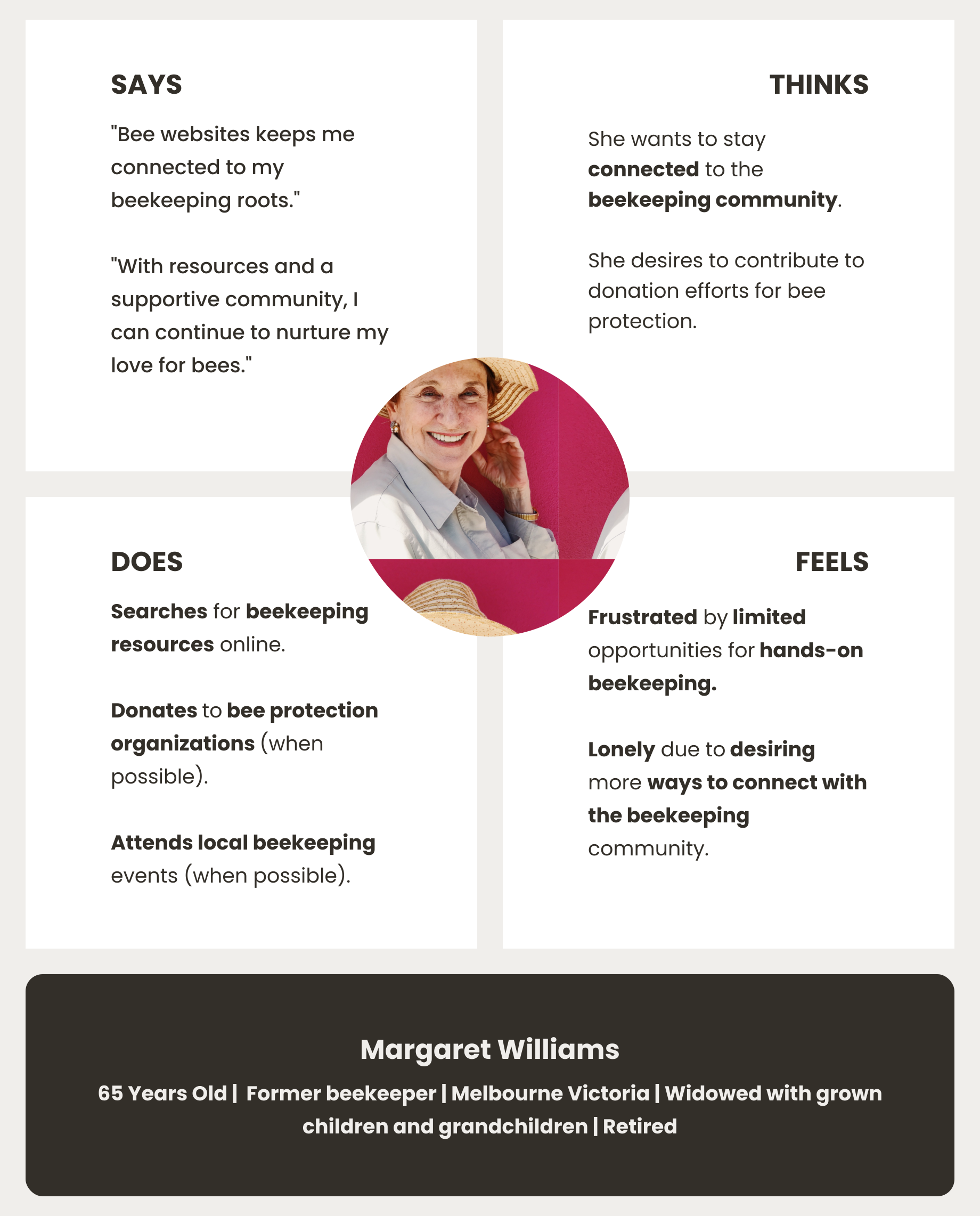
Margaret's Empathy Map
An empathy map for Margaret Williams, a user persona. The map 
                    is divided into four quadrants: Says, Thinks, Does, and Feels. 
                    The Says quadrant includes quotes like Bee websites keeps me connected 
                    to my beekeeping roots and With resources and a supportive community, 
                    I can continue to nurture my love for bees. The Thinks quadrant describes 
                    her desire to stay connected to the beekeeping community and contribute to 
                    donation efforts for bee protection. The Does quadrant mentions her searching 
                    for beekeeping resources online, donating to bee protection organizations, and a
                    ttending local beekeeping events. The Feels quadrant highlights her frustration with 
                    limited opportunities for hands-on beekeeping and loneliness due to desiring more ways 
                    to connect with the beekeeping community. A headshot of Margaret, an older woman with 
                    a straw hat, is centred above the quadrants. Below the map, her name, Margaret Williams, 
                    is displayed along with her personal information: 65 Years Old, Former beekeeper, 
                    Melbourne Victoria, Widowed with grown children and grandchildren, Retired.
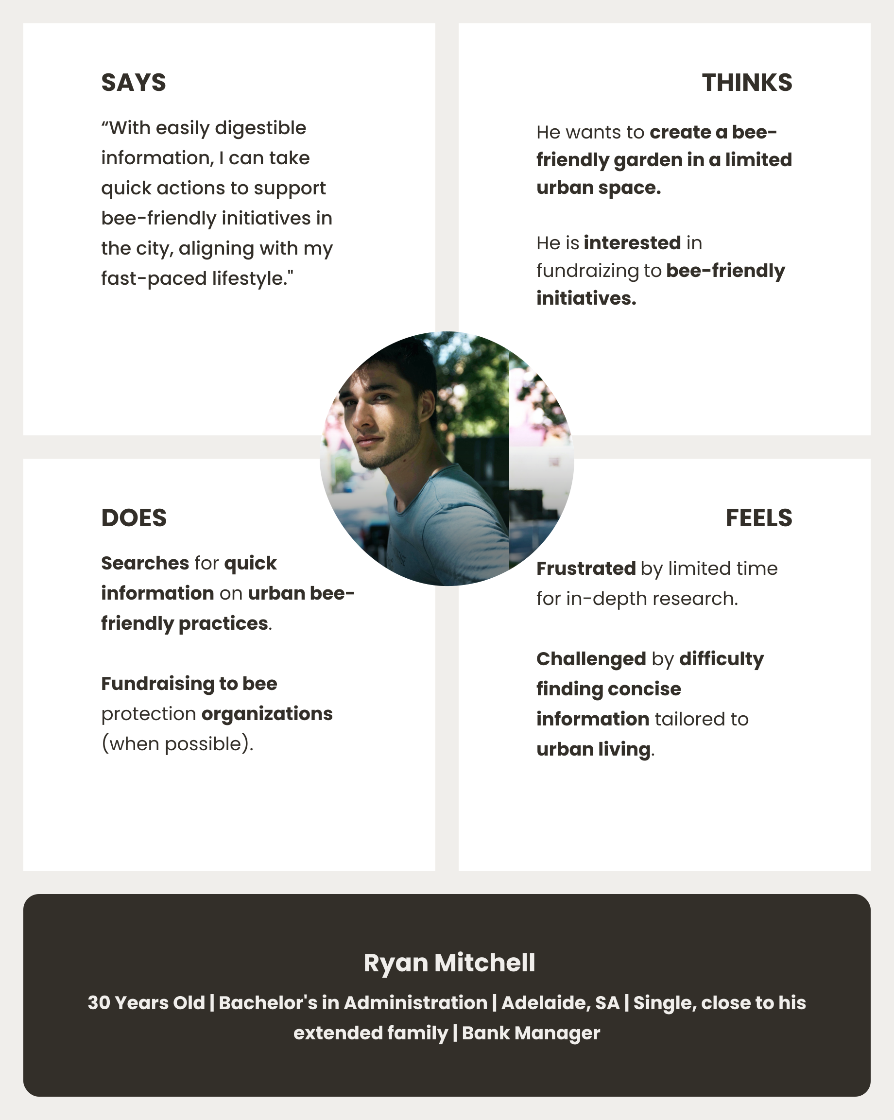
Ryan's Empathy Map
An empathy map for Ryan Mitchell, a user persona. The map is divided into four quadrants: 
                    Says, Thinks, Does, and Feels. The Says quadrant includes quotes like With easily 
                    digestible information, I can take quick actions to support bee-friendly initiatives 
                    in the city, aligning with my fast-paced lifestyle. The Thinks quadrant describes 
                    his desire to create a bee-friendly garden in a limited urban space and his interest in 
                    fundraising for bee-friendly initiatives. The Does quadrant mentions his searches for 
                    quick information on urban bee-friendly practices and fundraising for bee protection 
                    organizations. The Feels quadrant highlights his frustration with limited time for 
                    in-depth research and being challenged by difficulty finding concise information 
                    tailored to urban living. A headshot of Ryan, a young man with dark hair, is 
                    centred above the quadrants. Below the map, his name, Ryan Mitchell, is 
                    displayed along with his personal information: 30 Years Old, Bachelor's in 
                    Administration, Adelaide, SA, Single, close to his extended family, Bank Manager.
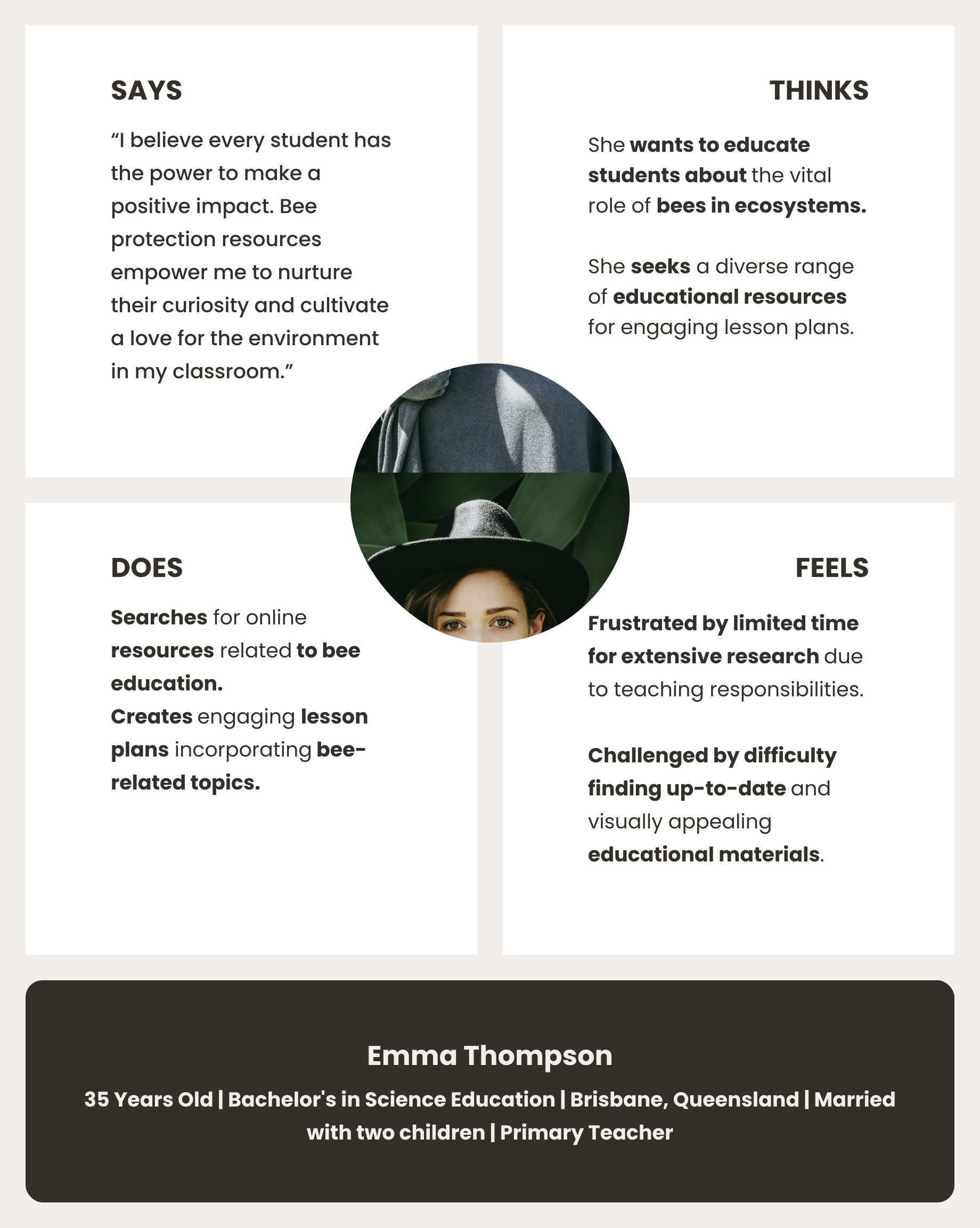
Emma's Empathy Map
An empathy map for Emma Thompson, a user persona. The map is divided into four 
                    quadrants: Says, Thinks, Does, and Feels. The Says quadrant includes statements 
                    like I want to make learning about bees fun and engaging for my students and 
                    It's hard to find up-to-date and reliable resources. The Thinks quadrant 
                    describes her desire to access diverse educational resources about bees 
                    and her belief that hands-on activities are crucial for learning. The 
                    Does quadrant mentions her searching for lesson plans online and attending professional
                    development workshops. The Feels quadrant highlights her frustration with the limited 
                    time she has for research and her feeling of being overwhelmed by the amount of information 
                    available. A headshot of Emma, a young woman with dark hair wearing a wide-brimmed hat, 
                    is centred above the quadrants. Below the map, her name, Emma 
                    Thompson, is displayed along with her personal information: 35 
                    Years Old, Bachelor's in Science Education, Brisbane, Queensland, Married with 
                    two children, Primary Teacher.

Empathy Maps Outcome

Considering the empathy maps, the website's tone should be warm, supportive, and community-focused, with a clear, actionable, and educational voice that promotes impact and connection.

User Journeys

A user journey is a method that visually maps the path a user takes to achieve a specific goal, highlighting their actions, thoughts, feelings, and pain points at each stage to identify opportunities for improvement.

The following four Journey Maps track the personas paths to achieve their goal.

Alex's User journey map (Nature Enthusiast)

Alex's journey map illustrates his path from hearing about the bee cause to trying to engage with a volunteer group and trying to find ways to share this abilities to the cause online.
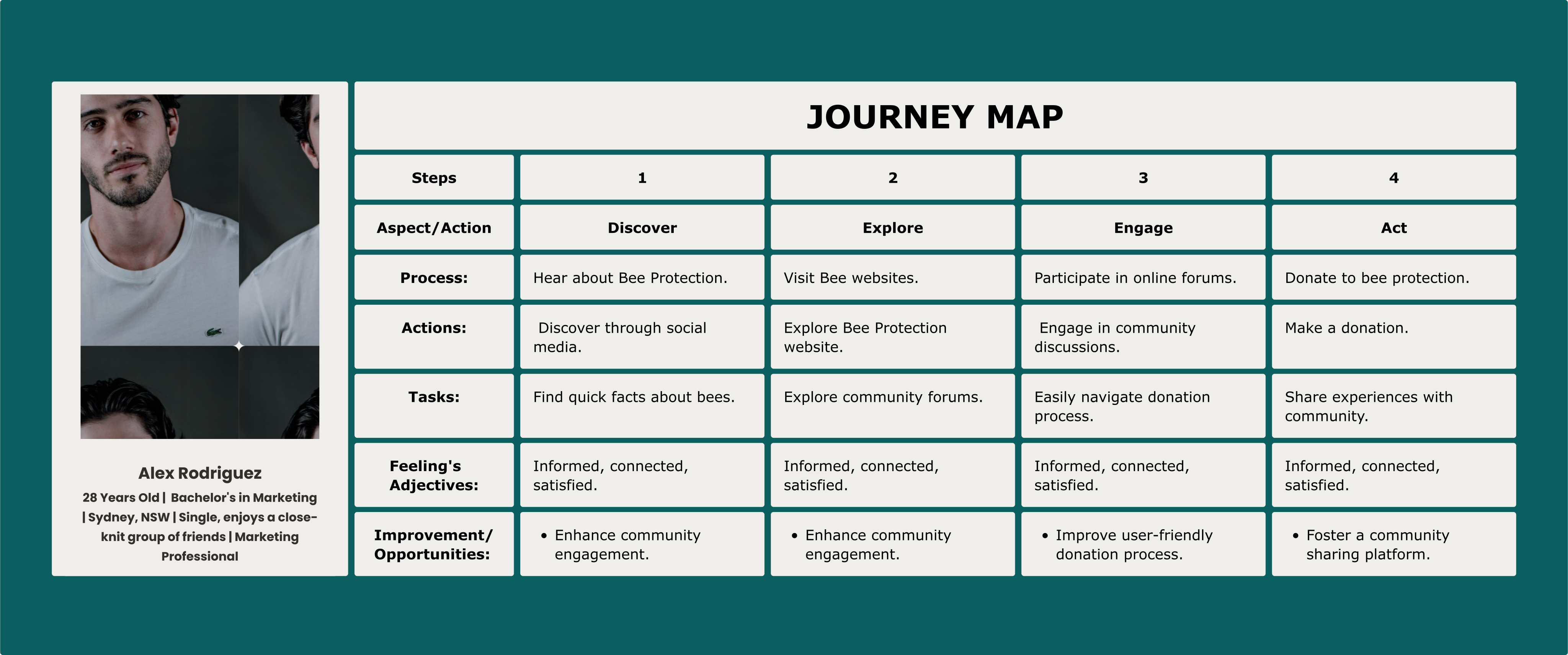
A journey map for Alex Rodriguez's persona, 28 Years Old, Bachelor's in Marketing, Sydney, NSW, single, enjoys a close-knit group of friends.
                The journey map outlines four steps:
                Step 1: Search
                Action: Search
                Task List: Hear about Bee Protection, Searching for quick facts about bees.
                Feelings Adjectives: Informed, connected.
                Improvement/Opportunities: N.A
                Step 2: Explore
                Action: Explore
                Task List: Navigate through many websites to find about the subject, Explore Bee Protection websites.
                Feelings Adjectives: Overwhelmed, informed.
                Improvement/Opportunities: N.A
                Step 3: Exploring groups
                Action: Exploring groups
                Task List: Looking for volunteering opportunities, Looking for ways to contribute to bee cause.
                Feelings Adjectives: Anxious, purposeful.
                Improvement/Opportunities: Foster online volunteering engagement options.
                Step 4: Acting
                Action: Acting
                Task List: Did not find some that could satisfied his ambitions, Abandoning the research.
                Feelings Adjectives: Frustrated.
                Improvement/Opportunities: Promote online cause contribution options.
Margaret's User journey map (Retiree)

Margaret's journey map illustrates her path to getting updated resources on sustainable beekeeping practices, engaging with the community, and taking action to support bee conservation.
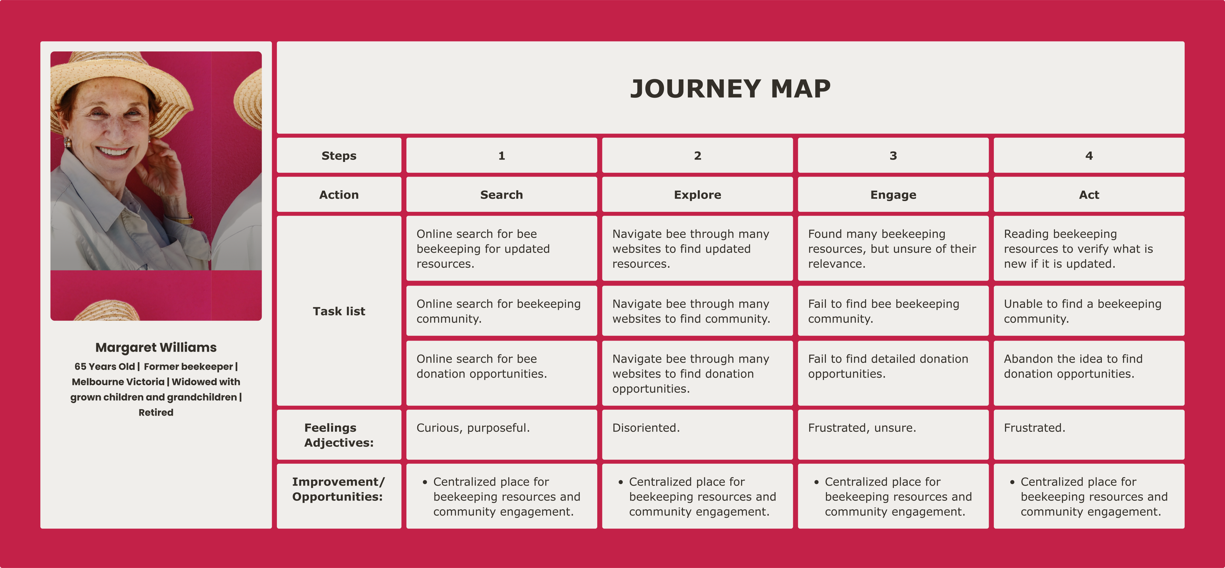
A journey map for the persona of Margaret Williams, a 65-year-old former beekeeper.
                    The persona section for Margaret Williams states:
                    Age: 65 Years Old
                    Occupation: Former beekeeper
                    Location: Melbourne Victoria
                    Family Status: Widowed with grown children and grandchildren
                    Current Status: Retired
                    The journey map outlines four steps:
                    Step 1: Search
                    Action: Search
                    Task List: Online search for bee beekeeping for updated resources; Online search for beekeeping community; Online search for bee donation opportunities.
                    Feelings Adjectives: Curious, purposeful.
                    Improvement/Opportunities: Centralised place for beekeeping resources and community engagement.
                    Step 2: Explore
                    Action: Explore
                    Task List: Navigate through many websites to find updated resources; Navigate through many websites to find community; Navigate through many websites to find donation opportunities.
                    Feelings Adjectives: Disoriented.
                    Improvement/Opportunities: Centralised place for beekeeping resources and community engagement.
                    Step 3: Engage
                    Action: Engage
                    Task List: Found many beekeeping resources, but unsure of their relevance; Fail to find bee beekeeping community; Fail to find detailed donation opportunities.
                    Feelings Adjectives: Frustrated, unsure.
                    Improvement/Opportunities: Centralised place for beekeeping resources and community engagement.
                    Step 4: Act
                    Action: Act
                    Task List: Reading beekeeping resources to verify what is new if it is updated; Unable to find a beekeeping community; Abandon the idea to find donation opportunities.
                    Feelings Adjectives: Frustrated.
                    Improvement/Opportunities: Centralised place for beekeeping resources and community engagement.
Ryan's User journey map (Busy Urbanite)

Ryan's journey map illustrates his path from searching for urban bee-friendly and safe garden resources to sharing his guide material via e-mail.
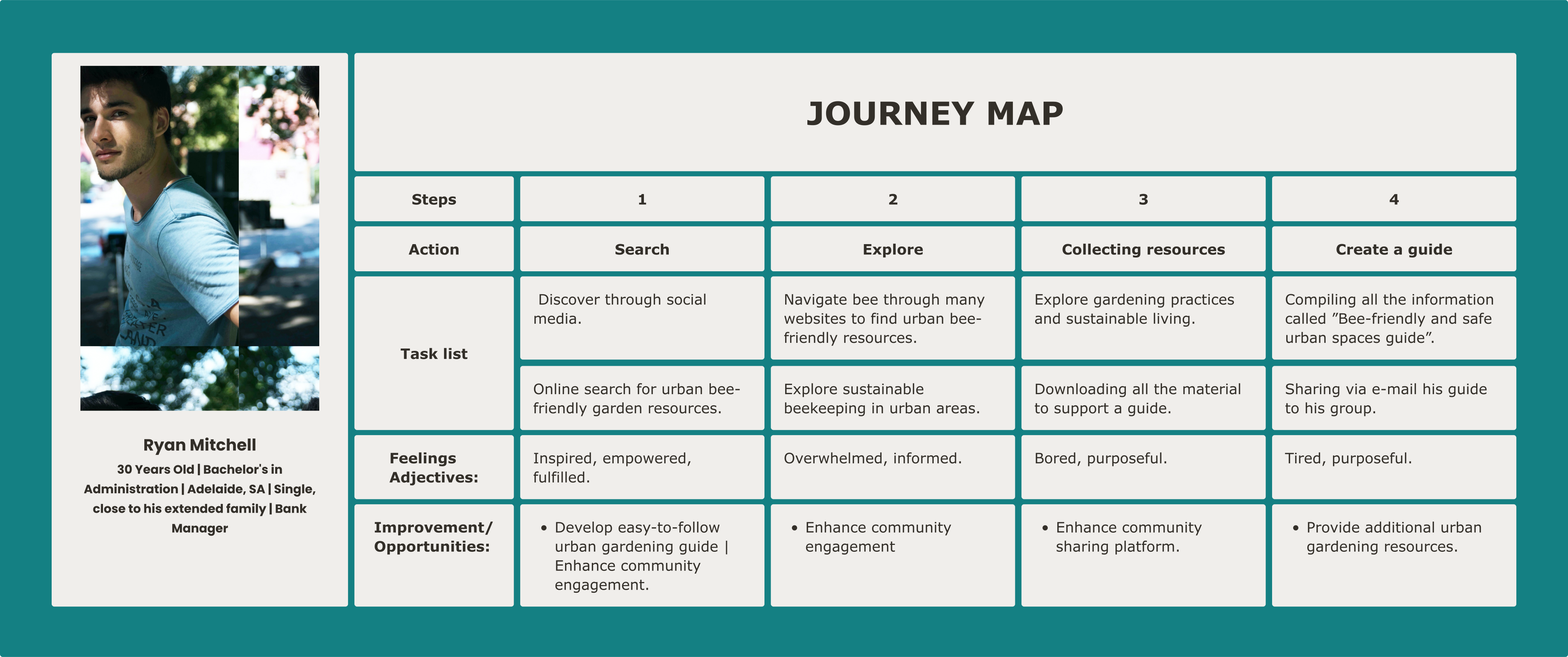

                    A journey map for the persona of Ryan Mitchell, a 30-year-old bank manager.
                    The persona section for Ryan Mitchell states:
                    Age: 30 Years Old
                    Education: Bachelor's in Administration
                    Location: Adelaide, SA
                    Relationship Status: Single, close to his extended family
                    Occupation: Bank Manager
                    The journey map outlines four steps:
                    Step 1: Search
                    Action: Search
                    Task List: Online search for urban bee-friendly garden resources; Find resources on sustainable beekeeping.
                    Feelings Adjectives: Inspired, empowered, fulfilled.
                    Improvement/Opportunities: Develop easy-to-follow urban gardening guide; Enhance community engagement.
                    Step 2: Explore
                    Action: Explore
                    Task List: Navigate through many websites to find urban bee-friendly resources; Explore sustainable beekeeping in urban areas.
                    Feelings Adjectives: Overwhelmed, informed.
                    Improvement/Opportunities: Enhance community engagement.
                    Step 3: Curating resources
                    Action: Collecting resources
                    Task List: Explore gardening practices and sustainable living; Downloading all the material to support a guide.
                    Feelings Adjectives: Bored, purposeful.
                    Improvement/Opportunities: Enhance community sharing platform.
                    Step 4: Create a lesson plan
                    Action: Create a guides
                    Task List: Compiling all the information called Bee-friendly and safe urban spaces guide; Sharing his guide with his group via email.
                    Feelings Adjectives: Tired, purposeful.
                    Improvement/Opportunities: Provide additional urban gardening resources.
Emma's User journey map (Educator)

Emma's journey map illustrates her path to searching for bee conservation material to creating her bee conservation lesson plan.
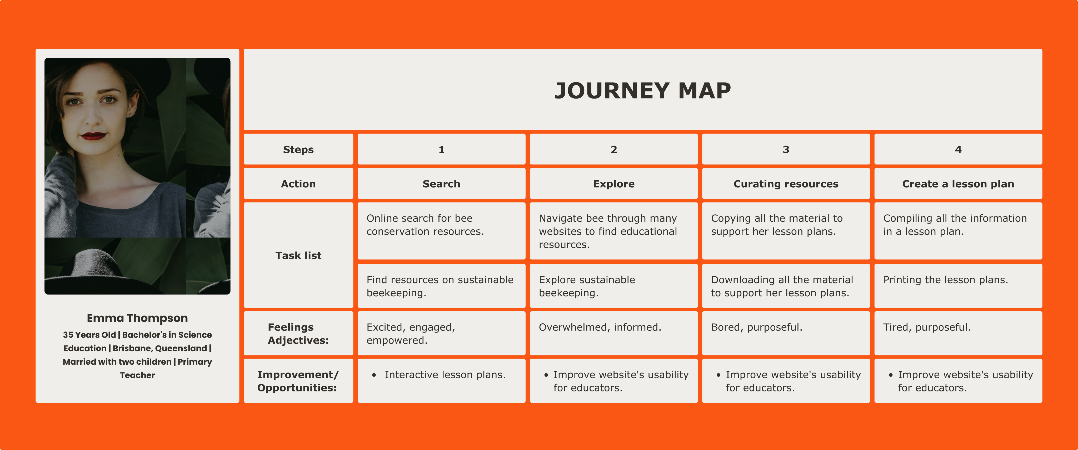
A journey map for the persona of Emma Thompson, a 35-year-old primary teacher.
                    The persona section for Emma Thompson states:
                    Age: 35 Years Old
                    Education: Bachelor's in Science Education
                    Location: Brisbane, Queensland
                    Family Status: Married with two children
                    Occupation: Primary Teacher
                    The journey map outlines four steps:
                    Step 1: Search
                    Action: Search
                    Task List: Online search for bee conservation resources; Find resources on sustainable beekeeping.
                    Feelings Adjectives: Excited, engaged, empowered.
                    Improvement/Opportunities: Interactive lesson plans.
                    Step 2: Explore
                    Action: Explore
                    Task List: Navigate through many websites to find educational resources; Explore sustainable beekeeping.
                    Feelings Adjectives: Overwhelmed, informed.
                    Improvement/Opportunities: Improve website's usability for educators.
                    Step 3: Curating resources
                    Action: Curating resources
                    Task List: Compiling all the material to support her lesson plans; Downloading all the material to support her lesson plans.
                    Feelings Adjectives: Bored, purposeful.
                    Improvement/Opportunities: Improve website's usability for educators.
                    Step 4: Create a lesson plan
                    Action: Create a lesson plan
                    Task List: Compiling all the information into a lesson plan; Printing the lesson plans.
                    Feelings Adjectives: Tired, purposeful.
                    Improvement/Opportunities: Improve website's usability for educators.

User Journey Maps Outcome

These journey maps highlight a critical gap between user intent and digital execution. While personas begin their journey with high motivation, the lack of a centralized information architecture leads to cognitive overload and "search fatigue." To bridge this gap, the solution must prioritize consolidated resources and streamlined navigation paths.

Pain Points

Pain points is a method used to identify and declare specific problems or frustrations that target users experience while interacting with a product, service, or system, providing critical focus for the design process.

These four key pain points highlight the primary barriers that prevent users from achieving their goals.

Information Challenge

Alex | Nature Enthusiast | 28 yo

Alex's photo, a young man with dark, wavy hair and a beard. 
                    He is looking directly at the viewer with a slight smile. The background is a 
                    plain, dark grey.

Pain points:

Alex, a nature enthusiast, struggles to find information about bees and ways to get involved in the cause. He needs a simple way to find information about bee conservation and get involved in the cause.

Engagement Barriers

Margaret | Retiree | 65 yo

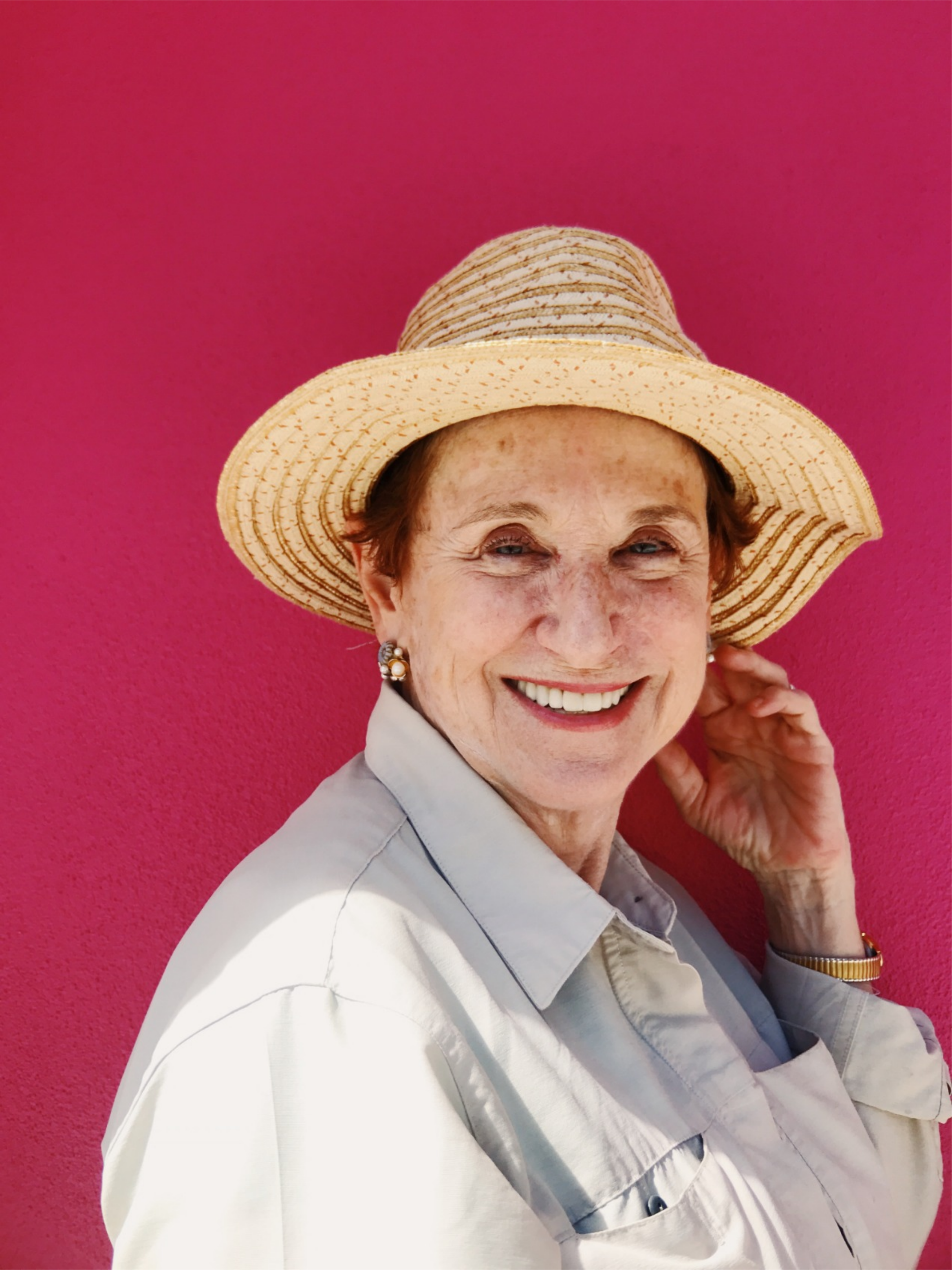
A close-up of Margaret with reddish-brown hair, 
                    smiling broadly and looking towards the camera. She is wearing 
                    a straw hat with a white band, and a light-colored collared shirt. 
                    The background is a vibrant magenta.

Pain points:

Margaret, a retired beekeeper, struggles to find an avenue to engage and contribute her skills and resources. She needs a way to engage and contribute her skills and resources.

Urban Spaces Guide

Ryan | Busy Urbanite | 30 yo

A close-up outdoor shot of Ryan, a young man with dark, 
                    styled hair and light stubble, looking to his left with a slight, 
                    neutral expression. Sunlight casts a shadow across part of his face. 
                    The background is softly blurred with hints of green foliage and light colors.

Pain points:

Ryan, a busy urbanite, struggles to find practical information on how to create a bee-friendly garden in a limited urban space. He needs guidance on creating bee-friendly urban spaces.

Educational Hurdle

Emma | Educator | 30 yo

A close-up portrait of Emma with fair skin and dark, short hair, 
                    wearing a black wide-brimmed hat. They have green eyes and dark red lipstick. 
                    The background is composed of large, green leaves.

Pain points:

Emma, an eco-conscious teacher, finds it challenging to compile a bee-themed lesson plan. She needs a readily available, pre-compiled lesson plan on bee conservation to save her time.

Emphasise Outcome

The Empathise phase concludes with a definitive list of pain points: Information Challenge, Engagement Barriers, Urban Spaces Guide, and Educational Hurdle friction. These pain points serve as the foundation for the Define phase.

Define

Define is the second phase of the Design Thinking process; it involves taking the information gathered during the Empathise phase to clearly establish the users' needs and problems.

To establish a clear project direction, this phase focused on four core outcomes:

  • Problem Statement
  • Storyboard
  • Goal Statement

Problem Statement

A problem statement is a method that takes the raw data of user pain points and structures it into a clear, actionable, and concise definition of the problem intended to be solved.

The following problem statements clearly define the key areas of friction identified, Information Challenge, Engagement Barriers, Urban Spaces Guide, Educational Hurdle, providing a focused foundation for subsequent design solutions.
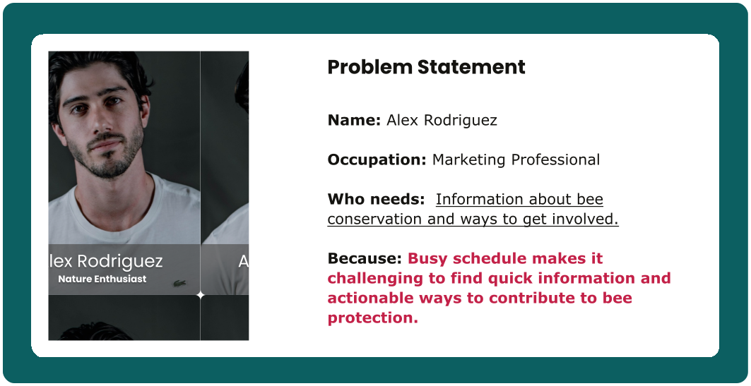
Alex's Problem Statement (Nature Enthusiast)
A problem statement for the persona of Alex Rodriguez. The text states:
                  Name: Alex Rodriguez
                  Occupation: Marketing Professional
                  Who needs: Concise information on bee conservation.
                  Because: Busy schedule makes it challenging to find quick, actionable ways to contribute 
                  to bee protection in a way that aligns with his lifestyle. The image also includes his 
                  small portrait of a young man with dark hair and a beard, labeled Alex Rodriguez 
                  Nature Enthusiast.
Margaret's Problem Statement (Retiree)
A problem statement for the persona of Margaret Williams. The text states:
                  Name: Margaret Williams
                  Occupation: Retired, former beekeeper
                  Who needs: Connection to the beekeeping community and easy way to donate.
                  Because: Current lack of a centralized platform impedes her ability to 
                  actively contribute and participate in donation initiatives for bee protection. 
                  The image also includes her small portrait of an older woman wearing a straw hat, 
                  labeled Margaret Williams Community Contributor.
Ryan's Problem Statement (Busy Urbanite)
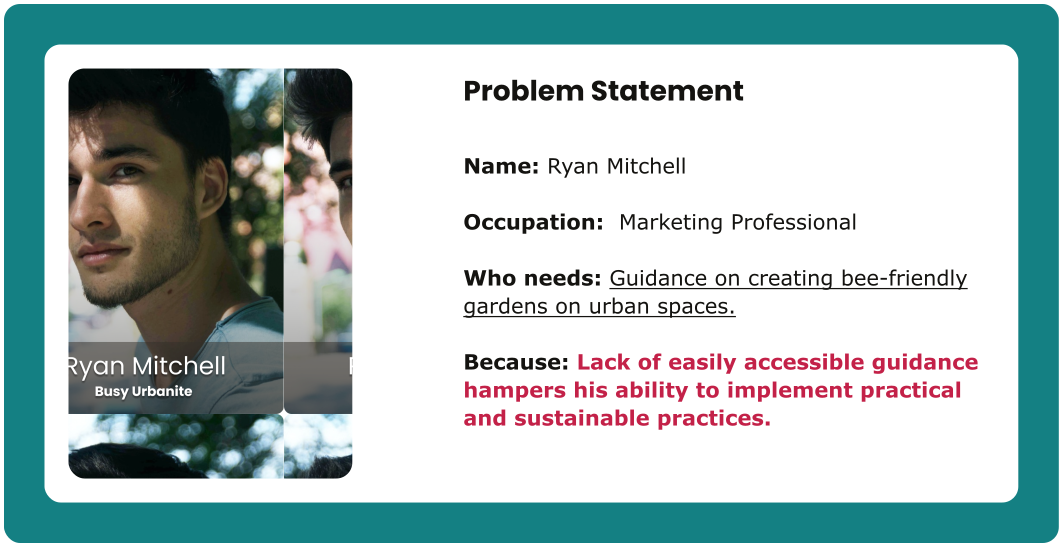
A problem statement for the persona of Ryan Mitchell. The text states:
                  Name: Ryan Mitchell
                  Occupation: Marketing Professional
                  Who needs: Information on creating a bee-friendly garden in a limited urban space.
                  Because: Lack of easily accessible guidance hampers his ability to 
                  implement practical and sustainable practices. The image also includes his small portrait, 
                  a young man with dark hair, labeled Ryan Mitchell Busy Urbanite.
Emma's Problem Statement (Educator)
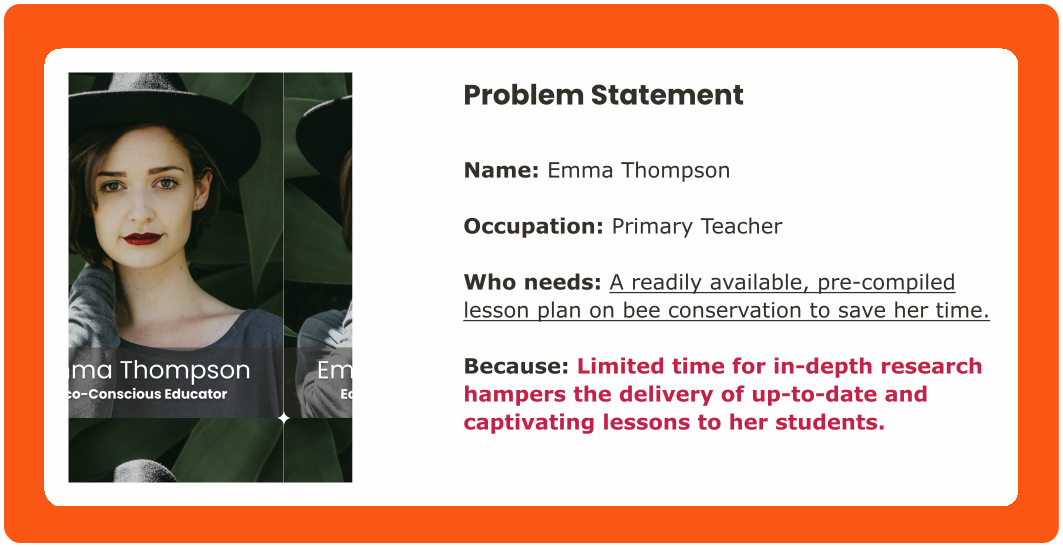
A problem statement for the persona of Emma Thompson. The text states:
                  Name: Emma Thompson
                  Occupation: Primary Teacher
                  Who needs: Educational resources on bee conservation.
                  Because: Limited time for in-depth research hampers the 
                  delivery of up-to-date and captivating lessons to her students. 
                  The image also includes her small portrait, a young woman wearing a black hat, 
                  labeled Emma Thompson Educational Innovator.

Storyboard

A storyboard is a visual representation of a user's journey, illustrating key moments, interactions, and emotions to communicate the narrative and context. It is used to understand, address, and clarify user experiences

The following storyboards visually illustrate the user experience and articulate pain points informed by the problem statement.

Alex's Storyboard (Nature Enthusiast)

Alex struggles to find reliable and accessible information about bees and ways to get involved. If Alex finds concise information on bee conservation, then he can quickly take actionable steps to contribute to bee protection, aligning with his busy schedule and sustainable living values.
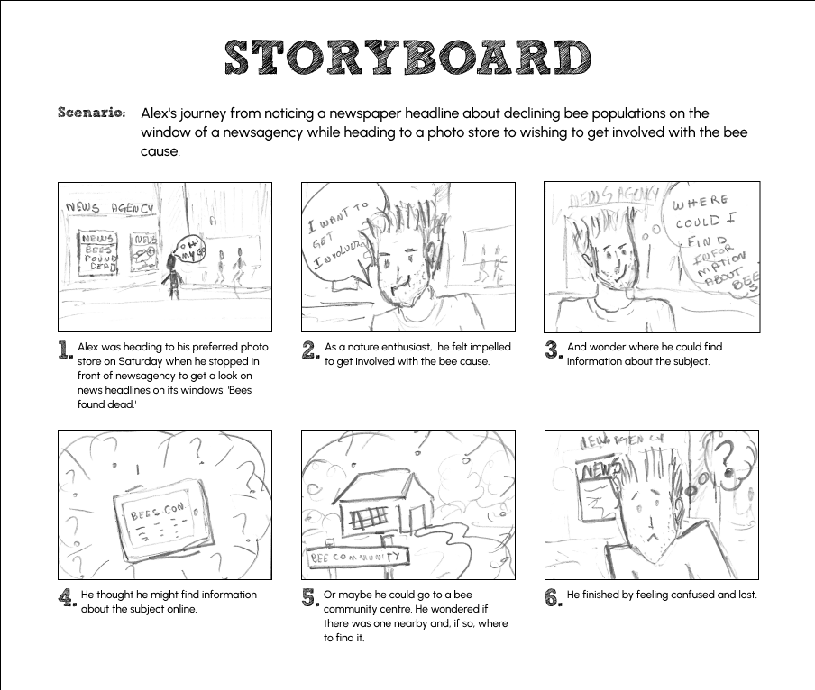
Alex Rodriguez's Problem Statement Storyboard shows a six-panel storyboard titled STORYBOARD 
                illustrating Alex's journey from noticing a newspaper headline about declining bee populations 
                to wishing to get involved with the bee cause, and his subsequent confusion.
                Panel 2: Depicts Alex looking concerned with a thought bubble stating 'I WANT TO GET INVOLVED'. 
                The caption describes him feeling impelled to get involved as a nature enthusiast.
                Panel 1: Shows Alex on a sidewalk looking at a newsagency window with headlines like 
                'BEES FOUND DEAD'. The caption states Alex stopped at the newsagency on his way to a 
                photo store to look at news headlines, specifically 'Bees found dead'.
                Panel 4: Illustrates Alex thinking, surrounded by question marks, with a sketch of 
                a computer keyboard and a box labeled 'BEES CON?'. The caption states he thought he 
                might find information online.
                Panel 3: Shows Alex still in front of the newsagency, with a thought bubble asking 
                'WHERE COULD I FIND INFORMATION ABOUT BEES?'. The caption explains he wondered where to 
                find information on the subject.
                Panel 5: Shows Alex thinking, with a drawing of a house labeled 'BEE COMMUNITY'. 
                The caption explains he wondered if he could go to a nearby bee community centre  
                and where to find it.
                Panel 6: Depicts a confused and lost Alex, with a question mark thought bubble 
                above his head and a newspaper in his hand. The caption says he finished by 
                feeling confused and lost.
                The storyboard visually narrates Alex's problem: his struggle to find reliable 
                and accessible information and ways to get involved with bee conservation, 
                leading to confusion and frustration.

Margaret's Storyboard (Retiree)

Margaret struggles to find an accessible avenue to engage and contribute her skills and resources to the bee cause. If Margaret gains access to a centralized platform for bee protection and community engagement, then she can actively contribute to bee protection, donate, and stay connected to her passion in retirement.
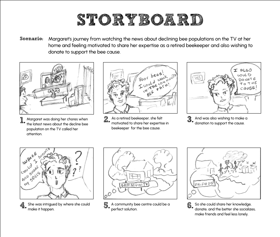
Margaret's Hypothesis Statement Storyboard shows a six-panel storyboard titled 
                STORYBOARD illustrating Margaret's journey from watching news about declining bee populations 
                and feeling motivated to help, to finding a potential solution in a community bee centre.
                Panel 1: Shows Margaret doing chores at home while a news report about declining bee
                populations is on TV. The caption states the news caught her attention.
                Panel 2: Depicts Margaret, as a retired beekeeper, thinking 'Poor bees! I could work in the 
                COMMUNITY BEE FARM!' The caption explains she felt motivated to share her expertise for the bee cause.
                Panel 3: Shows Margaret thinking 'I ALSO COULD DONATE TO THE CAUSE!' The caption says she 
                was also wishing to make a donation.
                Panel 4: Illustrates Margaret intrigued, thinking 'Where could I donate and share my skills?' 
                with question marks around her head. The caption states she was intrigued by where she could make it happen.
                Panel 5: Shows a simple drawing of a building with 'COMMUNITY' written on it and bees 
                flying around. The caption suggests a community bee centre could be a perfect solution.
                Panel 6: Depicts Margaret interacting with people and bees in a garden setting with 
                'FRIENDS' in a thought bubble. The caption explains that she could share her knowledge, donate, 
                socialize, make friends, and feel less lonely.
                The storyboard visually narrates Margaret's journey of identifying a way to contribute 
                her skills and resources to help declining bee populations through a community bee centre, 
                suggesting a positive social outcome.

Ryan's Storyboard (Busy Urbanite)

Ryan struggles to find the resources to implement his ideas effectively on creating bee-friendly urban spaces. If Ryan obtains accessible guidance on creating a bee-friendly garden, then he can implement practical and sustainable practices in his limited urban space, contributing to a healthier urban ecosystem.
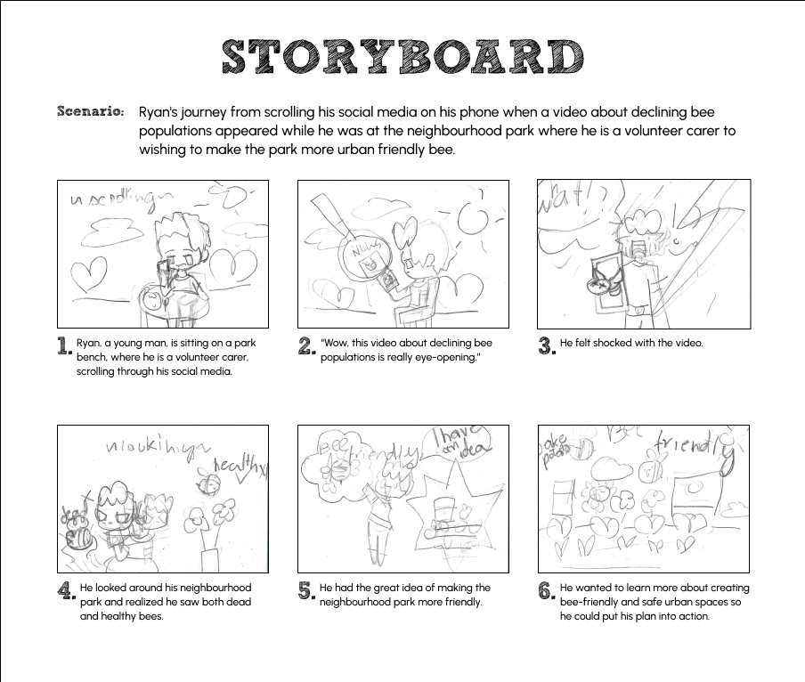
Ryan's Problem Statement Storyboard shows a six-panel storyboard titled STORYBOARD 
                illustrating Ryan's journey from scrolling social media and seeing a video about declining bee 
                populations, to wanting to make his neighborhood park more urban bee-friendly.
                Panel 1: Shows Ryan, a young man, sitting on a park bench, scrolling through his social media 
                on a phone. The caption states he is a volunteer park carer, scrolling social media.
                Panel 2: Depicts a video playing on Ryan's phone showing a bee, with a caption bubble saying 
                'Wow, this video about declining bee populations is really eye-opening!'. The caption states the 
                video is eye-opening.
                Panel 3: Shows Ryan looking shocked, holding his phone, with 'What!?' in a thought bubble. The 
                caption says he felt shocked with the video.
                Panel 4: Illustrates Ryan looking around his park, seeing both dead and healthy bees. The caption 
                states he realized he saw both dead and healthy bees in his park.
                Panel 5: Depicts Ryan thinking, with a thought bubble saying 'bee-friendly urban park idea!' 
                and a sketch of a park. The caption explains he had the great idea of making the neighborhood park 
                more friendly for bees.
                Panel 6: Shows Ryan looking determined, with a thought bubble depicting a 'bee-friendly' urban 
                space. The caption says he wanted to learn more about creating bee-friendly and safe urban spaces 
                so he could put his plan into action.
                The storyboard visually narrates Ryan's problem: his realization of the need for bee-friendly 
                urban spaces and his desire to learn how to create them.

Emma's Storyboard (Educator)

Emma finds it challenging to compile a bee-themed lesson plan. If Emma can easily access engaging educational resources on bee conservation, then she can deliver up-to-date and captivating lessons to her students, fostering a deeper understanding and appreciation for the environment.
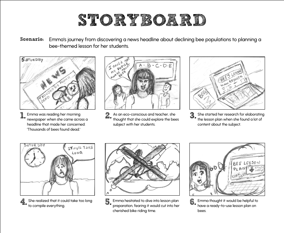
Emma's Problem Statement Storyboard shows a six-panel storyboard titled STORYBOARD illustrating 
                Emma's journey from discovering news about declining bee populations to facing challenges in 
                planning a bee-themed lesson for her students.
                Panel 1: Shows Emma reading a newspaper with a headline 'NEWS THOUSANDS FOUND DEAD'. The caption 
                states Emma was concerned by the headline.
                Panel 2: Depicts Emma, an eco-conscious teacher, in a classroom with a thought bubble indicating 
                'I could get MY PUPILS to learn ABOUT BEES!' and an alphabet on a board. The caption explains 
                she thought about teaching her students about bees.
                Panel 3: Shows Emma at a laptop, the screen displaying 'BEES LESSON NO RESULTS = 23', implying a 
                lack of tailored results. The caption states she started research but found a lot of content 
                about the subject.
                Panel 4: Illustrates Emma looking overwhelmed, a clock in the background, with a thought bubble 
                'IT WILL TAKE LONG'. The caption says she realized it would take too long to compile everything.
                Panel 5: Depicts a crossed-out bicycle and books, symbolizing a conflict. The caption explains 
                Emma hesitated, fearing it would cut into her cherished bike riding time.
                Panel 6: Shows Emma looking thoughtful and hopeful, with a thought bubble 'BEE LESSON PLAN QUICK 
                EASY'. The caption states Emma thought it would be helpful to have a ready-to-use lesson plan on bees.
                The storyboard visually narrates Emma's problem: the time and effort required to compile 
                comprehensive bee-themed lesson plans, which impacts her personal time and highlights the need for 
                readily available resources.

Goal Statement

Goal statement is a clear and concise articulation of the desired outcome of a project, guiding the design process and ensuring alignment with user needs and business objectives.

The following goal statement was defined based on the observation, insights, data, and feedback gathered through the user research:

The Bee Protectors Website, will empower users to access comprehensive bee conservation resources, facilitate the engagement in community, and contribute to fundraising and donation initiatives.

This will positively affect educators, nature enthusiasts, gardeners, and beekeepers by fostering environmental education, community connections, and sustainable practices.

Ideate

Ideate is the third phase of the Design Thinking process; it focuses on generating and exploring a wide range of potential solutions to the users' needs and problems identified during the Define phase.

The Ideate phase transforms problem definitions into actionable solutions; for this case study, it resulted in three core outcomes:

  • Hypothesis Statement
  • Need-Solution Framing
  • Information Architecture
  • User-Flow

Hypothesis Statement

A hypothesis statement is a method that informs educated, testable assumptions. It translates user insights or needs into actionable design solutions.

The following hypotheses were developed to address key pain points uncovered during research. These 'If-Then' statements serve to predict how specific design changes may impact the user and their experience.
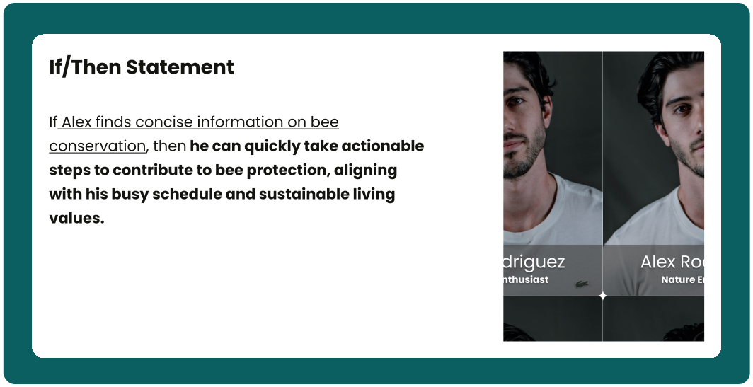
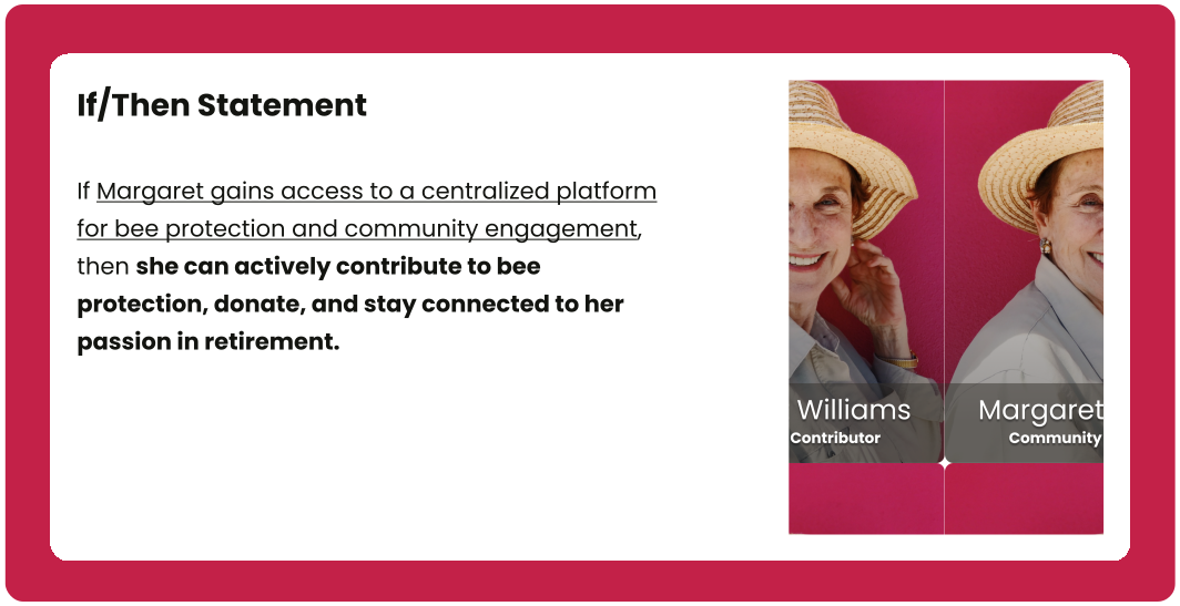
Alex's Hypothesis Statement (Nature Enthusiast)
An If/Then Statement for the persona of Alex Rodriguez. 
                  The text reads: If Alex finds concise information on bee conservation, then he 
                  can quickly take actionable steps to contribute to bee protection, aligning with 
                  his busy schedule and sustainable living values. 
                  The card includes a portrait of a young man with dark hair and a beard, 
                  labeled Alex Rodriguez Nature Enthusiast.
Margaret's Hypothesis Statement (Retiree)
 An If/Then Statement for the persona of Margaret Williams. 
                  The text reads: If Margaret gains access to a centralized platform for bee 
                  protection and community engagement, then she can actively contribute to bee 
                  protection, donate, and stay connected to her passion in retirement. 
                  The card includes a portrait of an older woman wearing a straw hat, 
                  labeled Margaret Williams Community Contributor.
Ryan's Hypothesis Statement (Busy Urbanite)
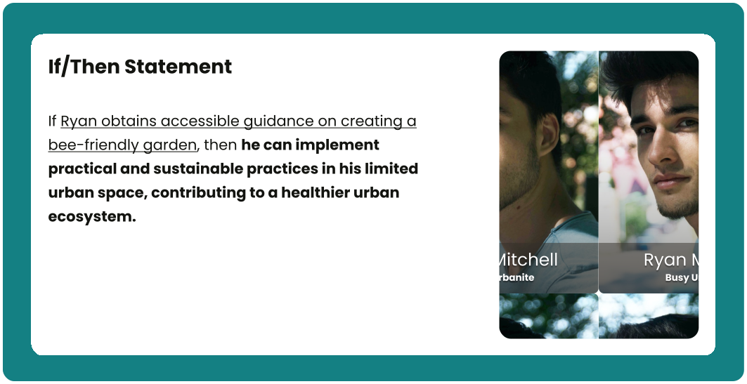
An If/Then Statement for the persona of Ryan Mitchell. 
                  The text reads: If Ryan obtains accessible guidance on creating a bee-friendly garden, 
                  then he can implement practical and sustainable practices in his limited urban 
                  space, contributing to a healthier urban ecosystem. 
                  The card includes a portrait of a young man with dark hair, labeled 
                  Ryan Mitchell Busy Urbanite.
Emma's Hypothesis Statement (Educator)
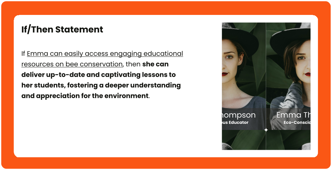
An If/Then Statement for the persona of Emma Thompson. 
                  The text reads: If Emma can easily access engaging educational resources on 
                  bee conservation, then she can deliver up-to-date and captivating lessons to 
                  her students, fostering a deeper understanding and appreciation for the environment. 
                  The card includes a portrait of a young woman wearing a black hat, labeled Emma 
                  Thompson Eco-Conscious Educator.

Need-Solution Framing

Need-Solution Framing is the process that bridges user needs and solutions, clearly stating problems alongside refined and prioritized ideas that will guide the project toward its desired outcome.

Design process led to refined solutions addressing user needs, seeking to enhance their experience.

Information Challenge

Alex | Nature Enthusiast | 28 yo

Alex's photo, a young man with dark, wavy hair and a beard. 
                    He is looking directly at the viewer with a slight smile. The background 
                    is a plain, dark grey.

User-needs:

Alex needs a simple way to find information and get involved.

Potential solution:

Create user-friendly Articles and Get Involved pages showing clear, accessible information about bee conservation and volunteer opportunities.

Engagement Barriers

Margaret | Retiree | 65 yo

A close-up of Margaret with reddish-brown hair, smiling broadly 
                    and looking towards the camera. She is wearing a straw hat with a 
                    white band, and a light-colored collared shirt. The background 
                    is a vibrant magenta.

User-needs:

Margaret needs a way to engage and contribute her skills and resources.

Potential solution:

Create a webpage with volunteer options for beekeepers, plus separate pages for donations and community fundraising initiatives.

Urban Spaces Guide

Ryan | Busy Urbanite | 30 yo

A close-up outdoor shot of Ryan, a young man with dark, styled hair 
                    and light stubble, looking to his left with a slight, neutral expression. 
                    Sunlight casts a shadow across part of his face. The background is 
                    softly blurred with hints of green foliage and light colors.

User-needs:

Ryan needs a guide on creating bee-friendly urban spaces.

Potential solution:

Create a dedicated webpage offering comprehensive, user-friendly guides to help users design and maintain bee-friendly spaces in cities.

Educational Hurdle

Emma| Educator | 30 yo

A close-up portrait of Emma with fair skin and dark, short hair, 
                    wearing a black wide-brimmed hat. They have green eyes and dark red lipstick. 
                    The background is composed of large, green leaves.

User-needs:

Emma needs a readily available, pre-compiled lesson plan to save time.

Potential solution:

Create a webpage offering engaging educational resources for kids, including lesson plans, quizzes, activities, and printable coloring pages.

Information Architecture

Information Architecture is a structural map of a digital product, illustrating how content is organized, labelled, and navigated to ensure clarity and usability for users.

This information architecture showcases key sections of the Bee Protectors Website, such as Resources, Get Involved, Donate, About Us, Contact, and their respective sub-features, such as Practical Guides and Fundraise, illustrating content organization.
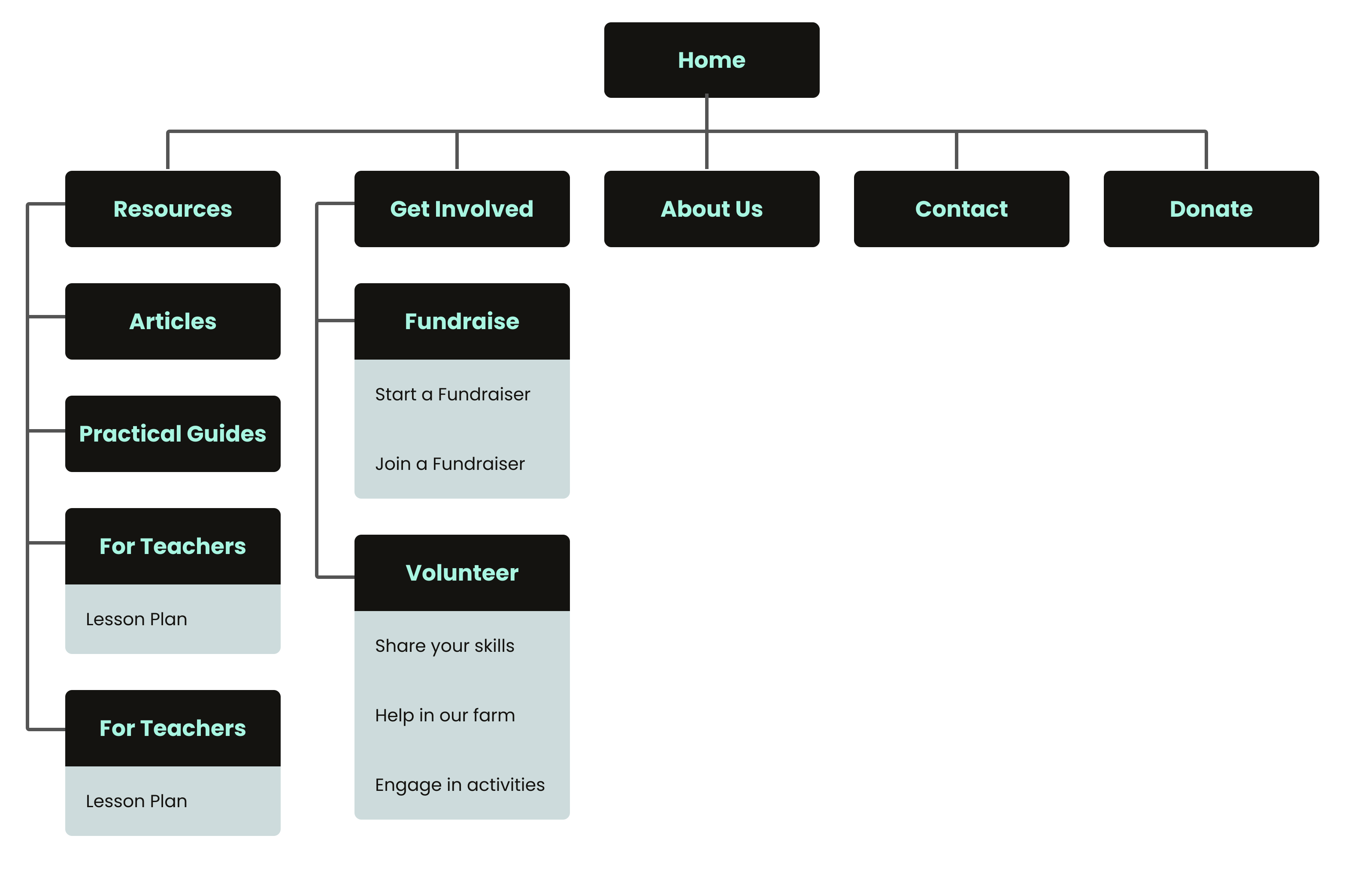
Bee Protectors Website Information Architecture
A sitemap diagram showing the hierarchical structure of a website. 
                  The top-level page is 'Home', branching to 'Resources', 'Get Involved', 'Donate', 
                  'About Us', and 'Contact'. 'Resources' includes 'Articles', 'Practical Guides', and 
                  'Educational' (with 'Lesson Plan', 'Colouring Pages', 'Quizzes'). 'Get Involved' 
                  branches to 'Fundraise' ('Start a Fundraise', 'Join a Fundraise') and 'Volunteer' 
                  ('Share your skills', 'Help in our farm', 'Engage to activities'). 'Donate', 'About Us', 
                  and 'Contact' have no inner-dividers.

User-Flow

User Flow is a visual representation of the pathways a user takes to complete tasks within a digital product, illustrating each step and decision point.

This user flow outlines the path to the website pages, a process designed to enhance user guidance and content discoverability. It clearly highlights available choices, accessible via the main menu.
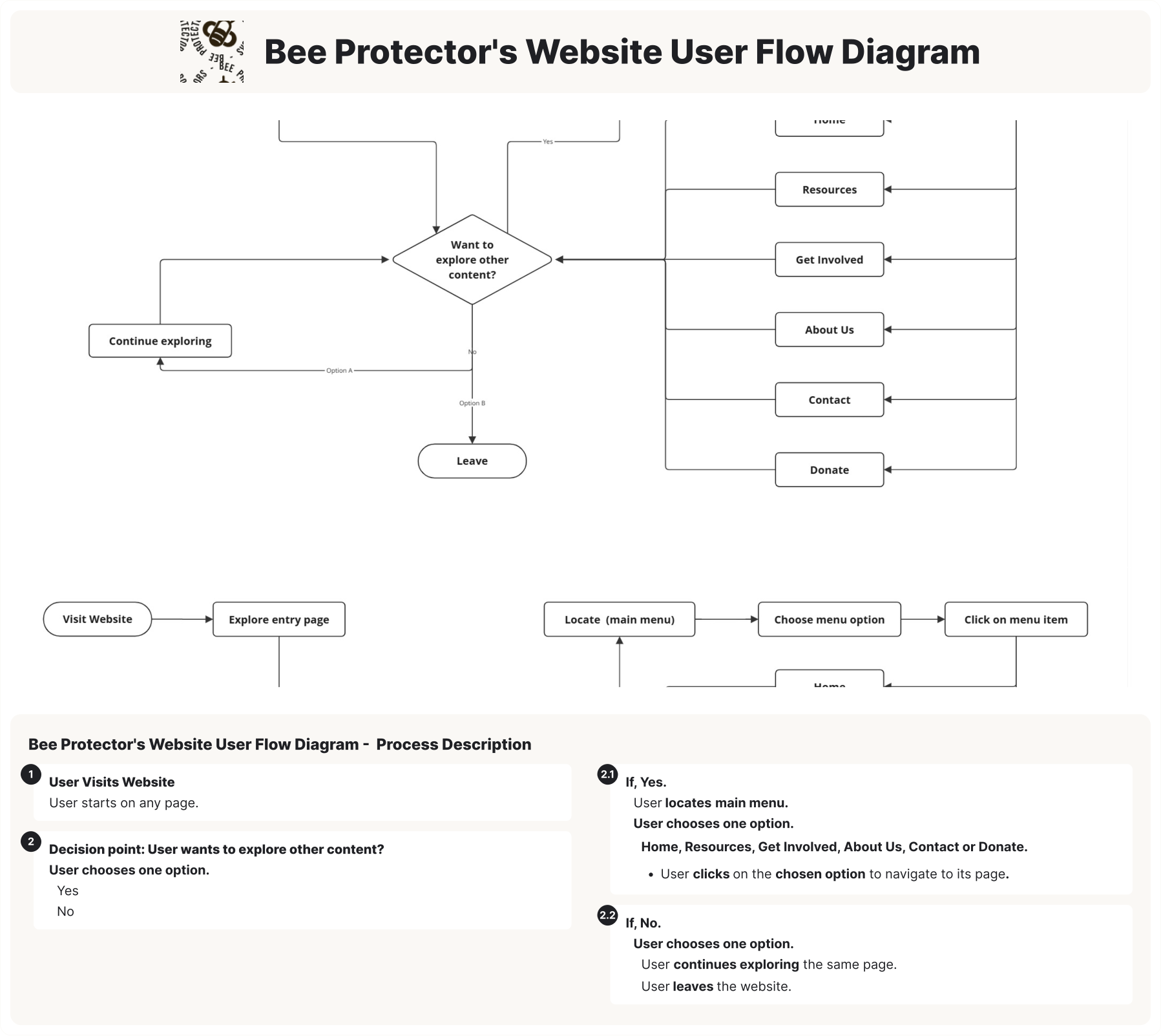
Detailed user flow diagram for the Bee Protector's website, 
                illustrating steps from visiting the site to exploring content via 
                the main menu (Home, Resources, About Us, Donate, etc.) or choosing 
                to leave.

Prototype

Prototype is the fourth phase of the Design Thinking process; it transforms ideas that emerged during the Ideate phase into a tangible, cost-saving, and low-risk model of a product used to validate its design and concept.

The Prototype phase demonstrates a systematic approach to design, translating concepts into tangible, testable representations. This phase produced five key outcome:

  • Sketches
  • Low-Fi Prototypes
  • Wireframes
  • Mockups
  • Hi-Fi Prototypes

Sketches

Sketches are rough, visual representations of design ideas, illustrating early concepts for layout, features, and user flow.

Sketches of the Bee Protectors’ key webpages were created to visualise the layout, content hierarchy, and navigation structure prior to developing the digital wireframes.

This image presents six hand-drawn wireframes representing key pages of the Bee Protectors website.
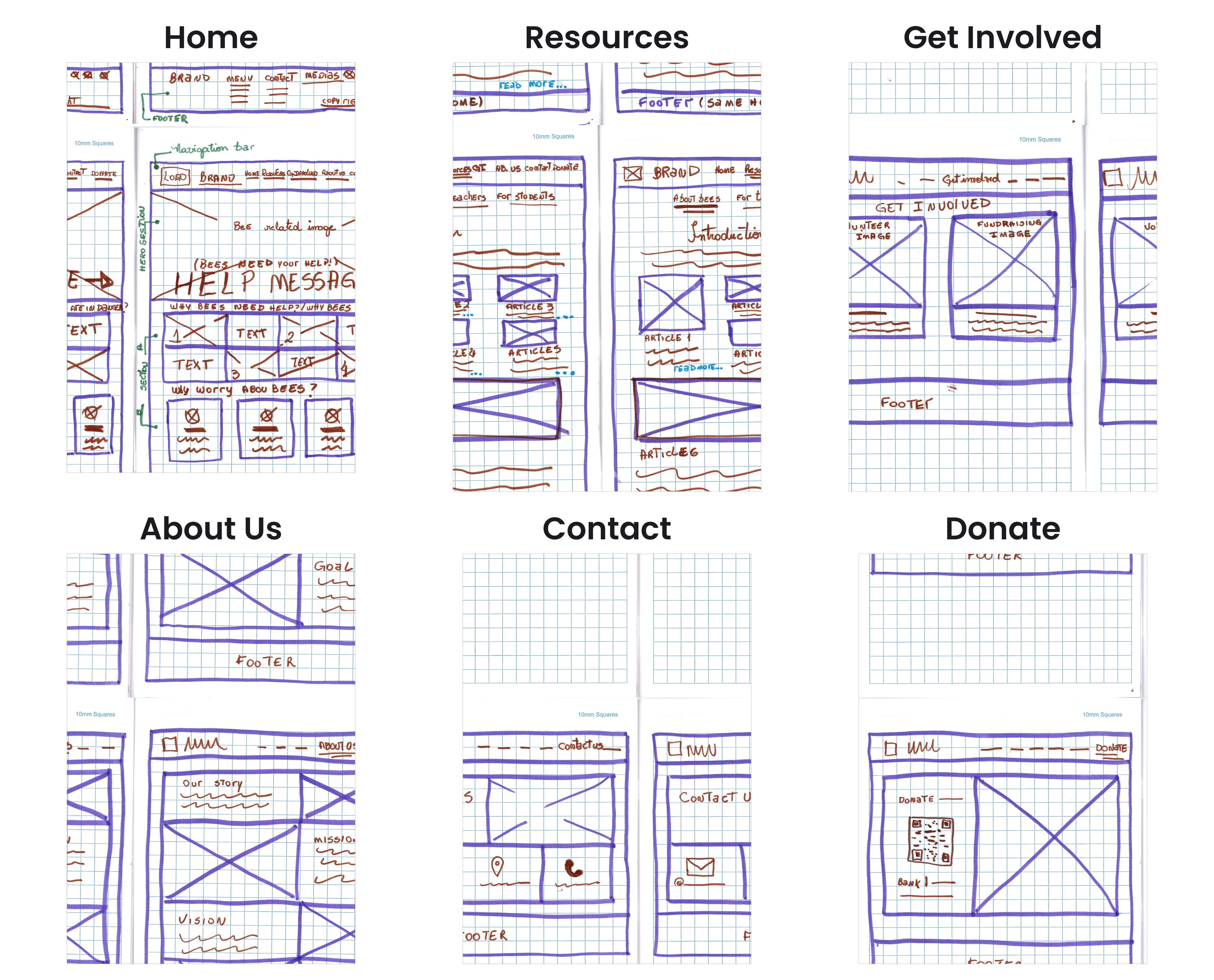
A set of six hand-drawn wireframes for a website, each representing different sections: 
                Home, Resources, Get Involved, About Us, Contact, and Donate. Each wireframe includes 
                placeholders for text and images with labels indicating their purpose.

Each sketch outlines layout elements such as headers, content blocks, images, and footers, corresponding to the Home, Resources, Get Involved, About Us, Contact, and Donate pages.

Wireframes

Wireframes are digital visual outlines of a digital product's layout and structure, illustrating the placement of content, features, and navigation elements.

Wireframes were created for Bee Protectors' website, defining layout, content hierarchy, and navigation.
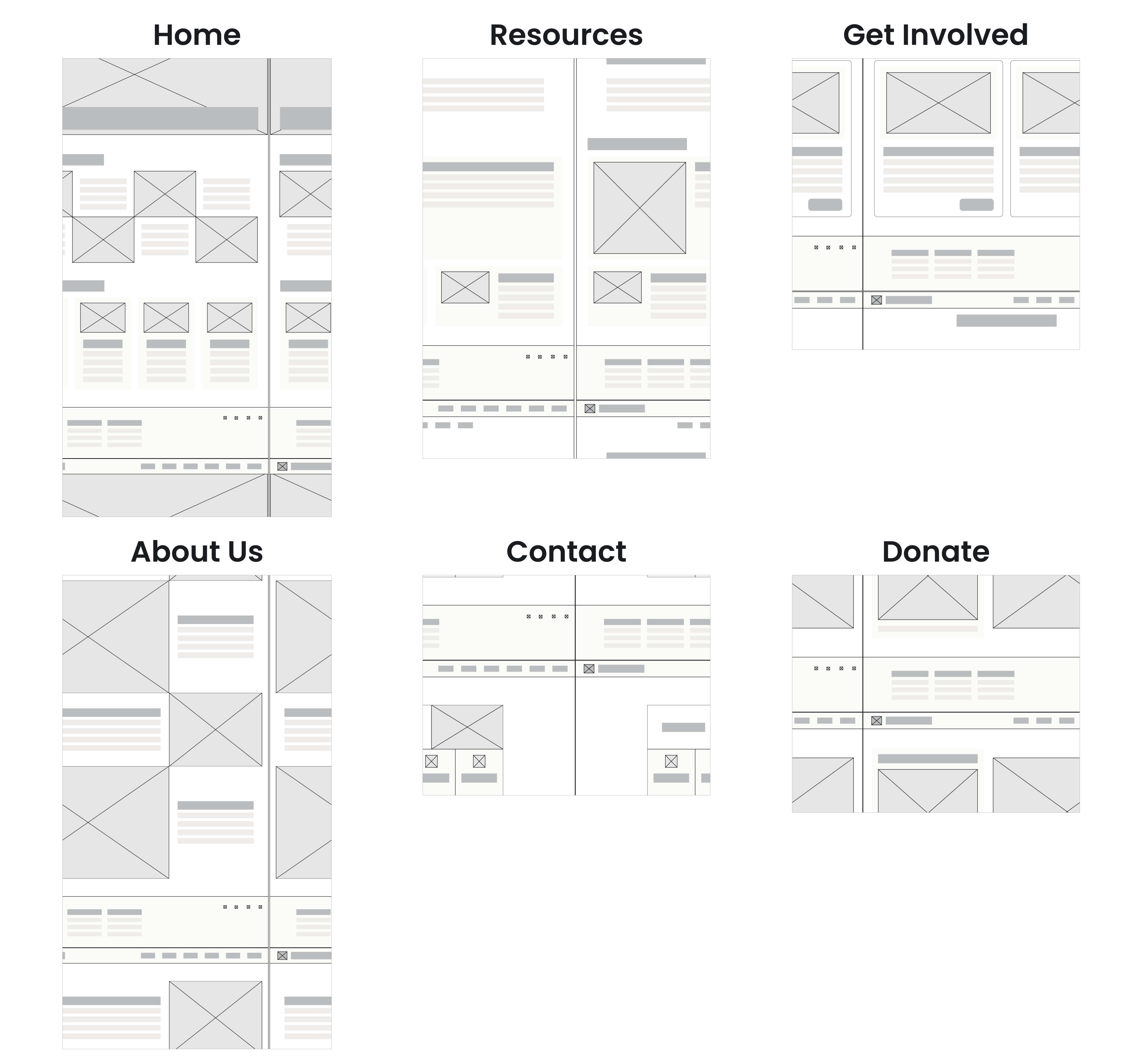
A set of digital wireframes for a website, each representing different sections: Home, Resources, 
                Get Involved, About Us, Contact, and Donate. Each wireframe includes placeholders for text and 
                images with labels indicating their purpose.

Each wireframe outlines layout elements such as headers, content blocks, images, and footers, corresponding to the Home, Resources, Get Involved, About Us, Contact, and Donate pages.

Low-fidelity prototype

Low-fidelity prototypes are early, simplified representations of a digital product, illustrating basic functionality and user flow to facilitate quick and inexpensive testing of core concepts.

 A low-fidelity prototype of the Bee Protectors’ website was developed. This initial interactive model allowed to quickly test core user flows and gather early feedback on navigation and functionality before investing in hi-fidelity visuals.

Figma: Low-Fidelity Prototype of Bee Protectors Website

The low-fidelity prototype above demonstrates the user flow of the Bee Protectors’ website, allowing users to navigate between key pages such as Home, Resources, Get Involved, About Us, Contact, and Donate.

Mockups

Mockups are detailed visual representations of a digital product's design, showcasing layout, color, typography, and branding elements to provide a realistic preview of the final product.

To visualize the final user interface of the Bee Protectors' website, such as the intended visual style and branding, a comprehensive set of initial digital mockups was created.
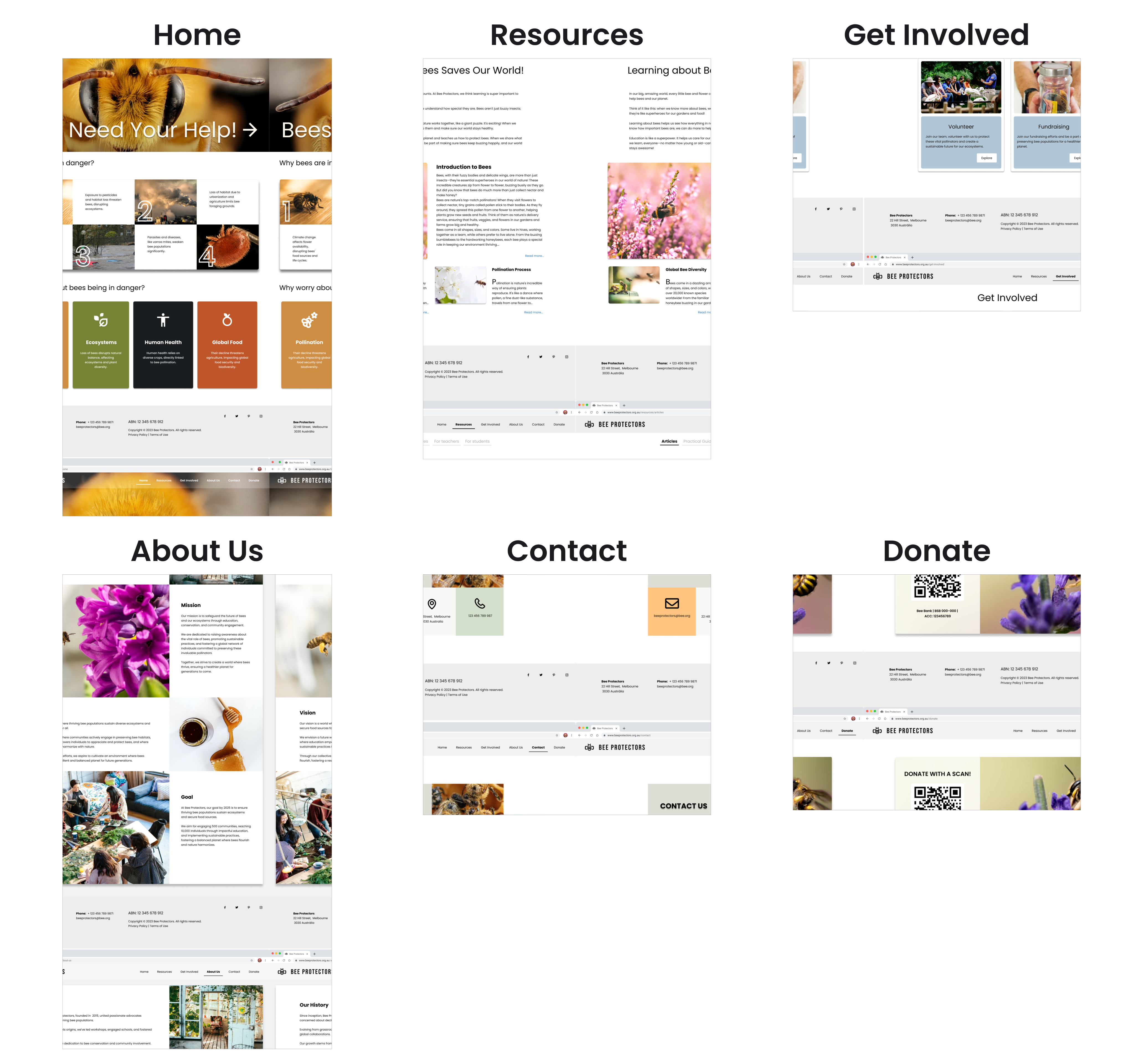
Six key Pages of the Bee Protectors' Website
A visual mockup of the Bee Protectors website, displaying six 
                  key pages: Home, Resources, Get Involved, About Us, Contact, and Donate. 
                  The design features a consistent colour palette of earthy tones, prominent 
                  imagery of bees and natural landscapes, and clear, legible typography. 
                  The Home page highlights a call to action Bees Need Your Help! and sections 
                  on bee facts. The Resources page offers educational content. Get Involved 
                  presents volunteer opportunities. About Us details the organization's mission. 
                  Contact provides methods of communication, and Donate includes a QR code 
                  for contributions.

The mock-ups presented above illustrate the layout, color scheme, typography, and branding elements, offering a detailed preview of the six key pages (Home, Resources, Get Involved, About Us, Contact, and Donate) of the Bee Protectors' website.

Moving to the Resources page a set of mockups was created to visualize the final user interface.
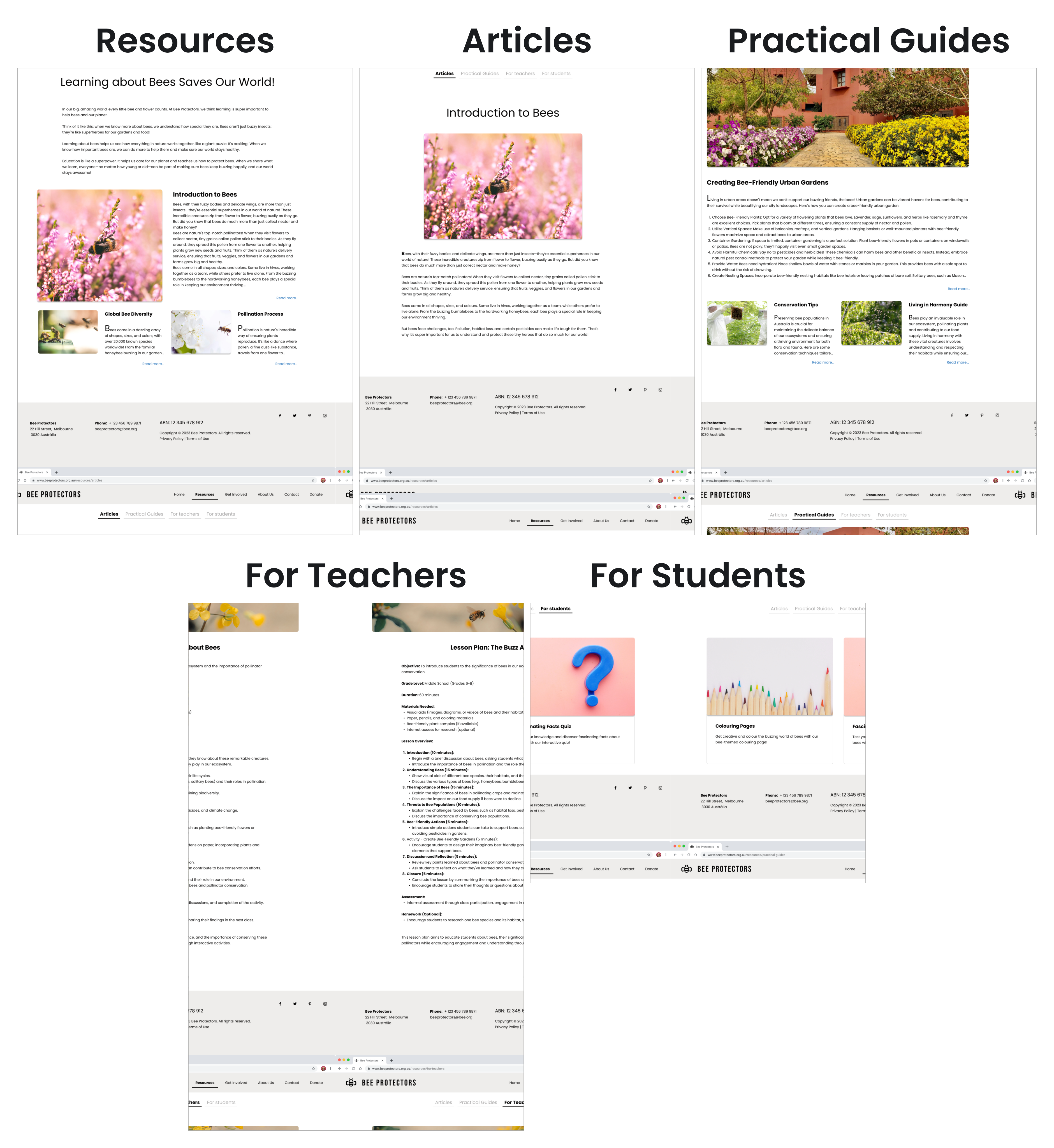
Six Key Sub-pages of Resources Section
This image displays five digital mock-ups of sub-pages from the Bee Protectors 
                  website, focusing on educational content. They include:
                  Resources: A general overview page with links to Introduction to Bees and Plant Diversity.
                  Articles: Specifically showing the Introduction to Bees article with text and an 
                  image of a bee on a flower.
                  Practical Guides: Featuring a Creating Bee-Friendly Urban Gardens guide with 
                  images of gardens and tips.
                  For Teachers: Presenting a Lesson Plan: The Busy About Bees with educational content.
                  For Students: A more visually playful page, possibly for younger audiences, 
                  with a question mark icon.
                  The mock-ups maintain a consistent design with the main Bee Protectors website, 
                  using similar headers, clean layouts, and relevant imagery.

The mock-ups presented above illustrate the layout, color scheme, typography, and branding elements, offering a detailed preview of the six key pages (Resources, Articles, Practical Guides, For Teachers and For Students) of the Bee Protectors' website.

Moving into the Get Involved page a set of mockups was created to visualize the final user interface.
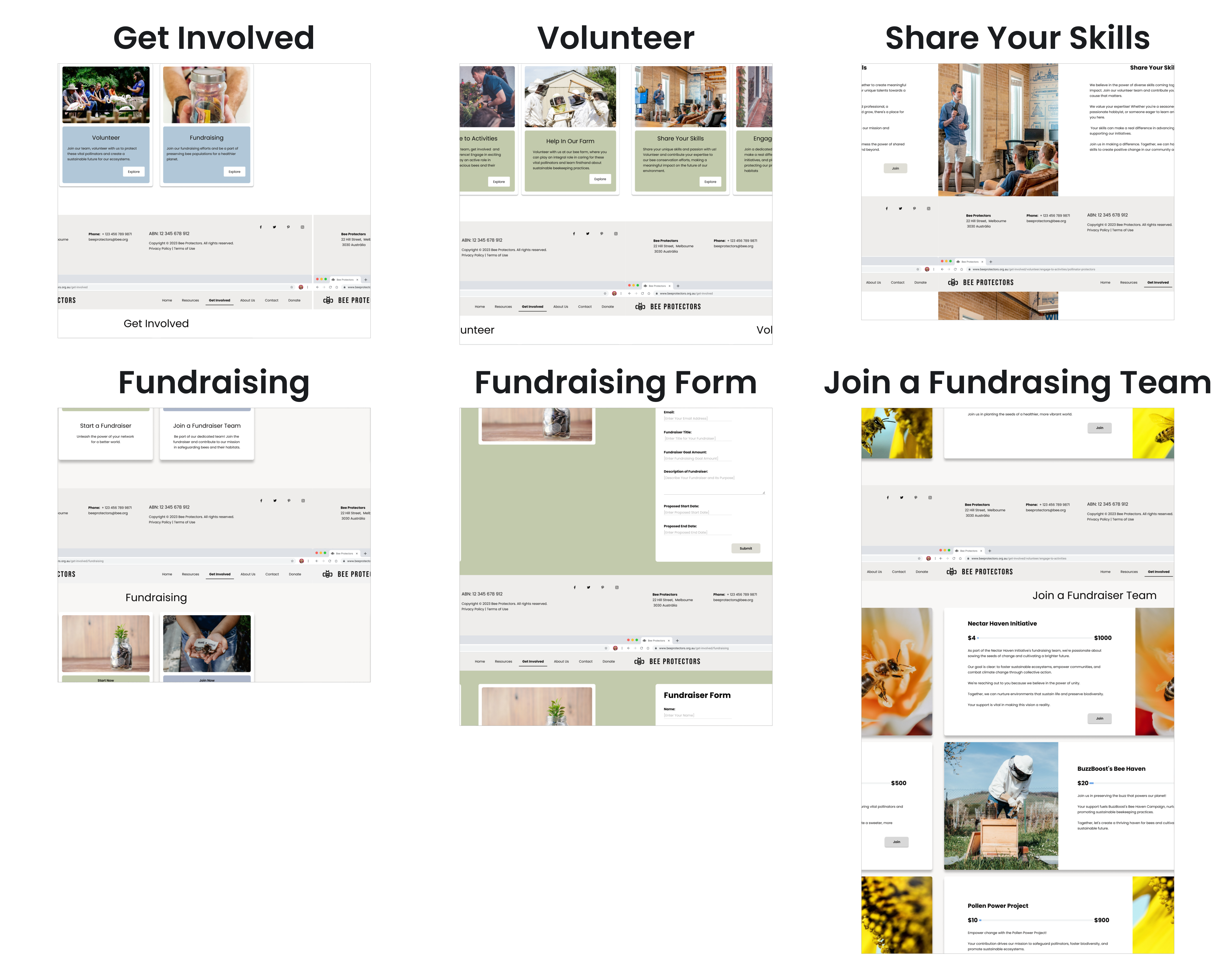
Six key Pages of the Bee Protectors' Website
This image presents six digital mock-ups of sub-pages from the Bee 
                  Protectors website, specifically detailing how users can Get Involved. 
                  They include:
                  Get Involved: An overview page with options like 
                  Gardening and Events.
                  Volunteer: A page showcasing various volunteer opportunities 
                  with images, such as Design & Education and On-site Support.
                  Share Your Skills: A page for individuals to offer specific 
                  expertise, with text and an image of someone working.
                  Fundraising: An overview of fundraising initiatives, featuring 
                  images related to planting and community work.
                  Fundraising Form: A dedicated form for individuals interested 
                  in fundraising, with a simple layout.
                  Join a Fundraising Team: A detailed page for joining a team, 
                  including images of bees and beekeeping, along with sections 
                  for different fundraising targets.
                  The mock-ups maintain a consistent design with the main Bee 
                  Protectors website, using similar headers, clean layouts, 
                  and relevant imagery.

The mock-ups presented above illustrate the layout, color scheme, typography, and branding elements, offering a detailed preview of the six key pages (Get Involved, Volunteer, Share Your Skills including Volunteering option, Fundraising, Fundraising Form, path to start a new fundraiser team, and Join a Fundraising Teams including the option to engage to an existent team) of the Bee Protectors' website.

Hi-fidelity prototype

Hi-fidelity prototypes visually and functionally mimic the final product, illustrating realistic interactions, visual design, and user flows to facilitate thorough testing.

A Hi-fidelity prototype of the Bee Protectors Website was developed, incorporating visual design into a more detailed and interactive model. This aimed to further refine user flows and gather feedback on the near-final user experience.

Figma: Hi-Fidelity Prototype of Bee Protector Website

The hi-fidelity prototype above demonstrates the user flow of the Bee Protectors’ website, allowing users to navigate between key pages such as Home, Resources, Get Involved, About Us, Contact, and Donate.

Test

Test is the fifth phase of the Design Thinking process; it actively evaluates the prototype’s concept, user flow, design, and functionality through real user interaction and feedback, identifying usability issues and driving refinements.

In this phase, designs were assessed to identify usability issues and directly inform further refinements. The key outcomes of this phase includes:

  • Usability Study
  • Refinement
  • Accessibility
  • Final Prototype

Usability study

Two rounds of usability studies were conducted to evaluate the prototype with users, identifying pain points and friction to inform design refinements for an intuitive website.

Findings from the first study guided the transition from wireframes to mock-ups, while the second study utilised a hi-fidelity prototype to identify specific flows and elements that required further refinement.

Low-Fidelity | Usability Study

An unmoderated usability study was conducted using the Low-fidelity prototype of the Bee Protectors website.
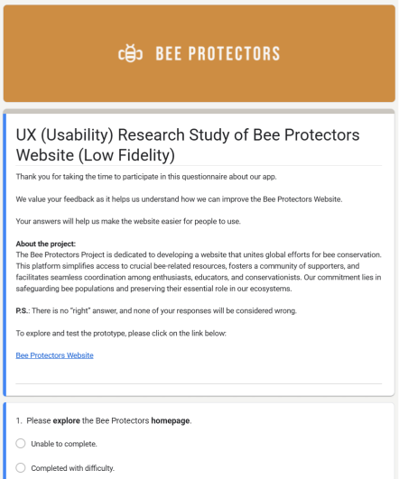
Low-Fidelity Usability Study Form
Form: UX Study of Bee ProtectorsWebsite Low-Fidelity  Screenshot of the introductory page for the UX (Usability) 
                  Research Study of Bee Protectors Website (Low Fidelity). The page features 
                  the organization's logo, BEE PROTECTORS, in a brown banner. 
                  The text below introduces the project as a platform for global bee 
                  conservation efforts, mentions the low-fidelity prototype, and includes a 
                  link to the prototype. The first question listed is: 1. Please explore the 
                  Bee Protectors homepage, followed by two radio button options: Unable to complete. 
                  and Completed with difficulty.
Low-fidelity Usability Study Outcome

The test results from the low-fidelity prototype showed that the navigation was intuitive, and users found the information they needed.

Hi-Fidelity | Usability Study

An unmoderated usability study was conducted using the hi-fidelity prototype of the Bee Protectors website.
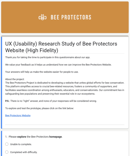
Hi-Fidelily Usability Study Form
Form: UX Study of Bee Protectors Website Hi-Fidelity  Screenshot of the introductory page for the UX (Usability) Research Study of Bee 
                  Protectors Website (High Fidelity). The page features the organization's logo, BEE PROTECTORS, 
                  in a brown banner. The text below introduces the project as a platform for global bee 
                  conservation efforts, mentions the high-fidelity prototype, and includes a link to the 
                  prototype. The first question listed is: 1. Please explore the Bee Protectors homepage, 
                  followed by two radio button options: Unable to complete. and Completed with difficulty.
Hi-fidelity Usability Study Outcome

Following the hi-fidelity usability study, seven key areas for website improvement were identified: Homepage Refinement, Where Am I? (Orientation and Location Awareness Cues), Navbar Structure, Articles Clickable Elements, Image Perception, Article's Scanning Difficulty and Task Completion with Card.

Homepage Findings

Finding: Users reported no clear interaction cues in the Homepage.
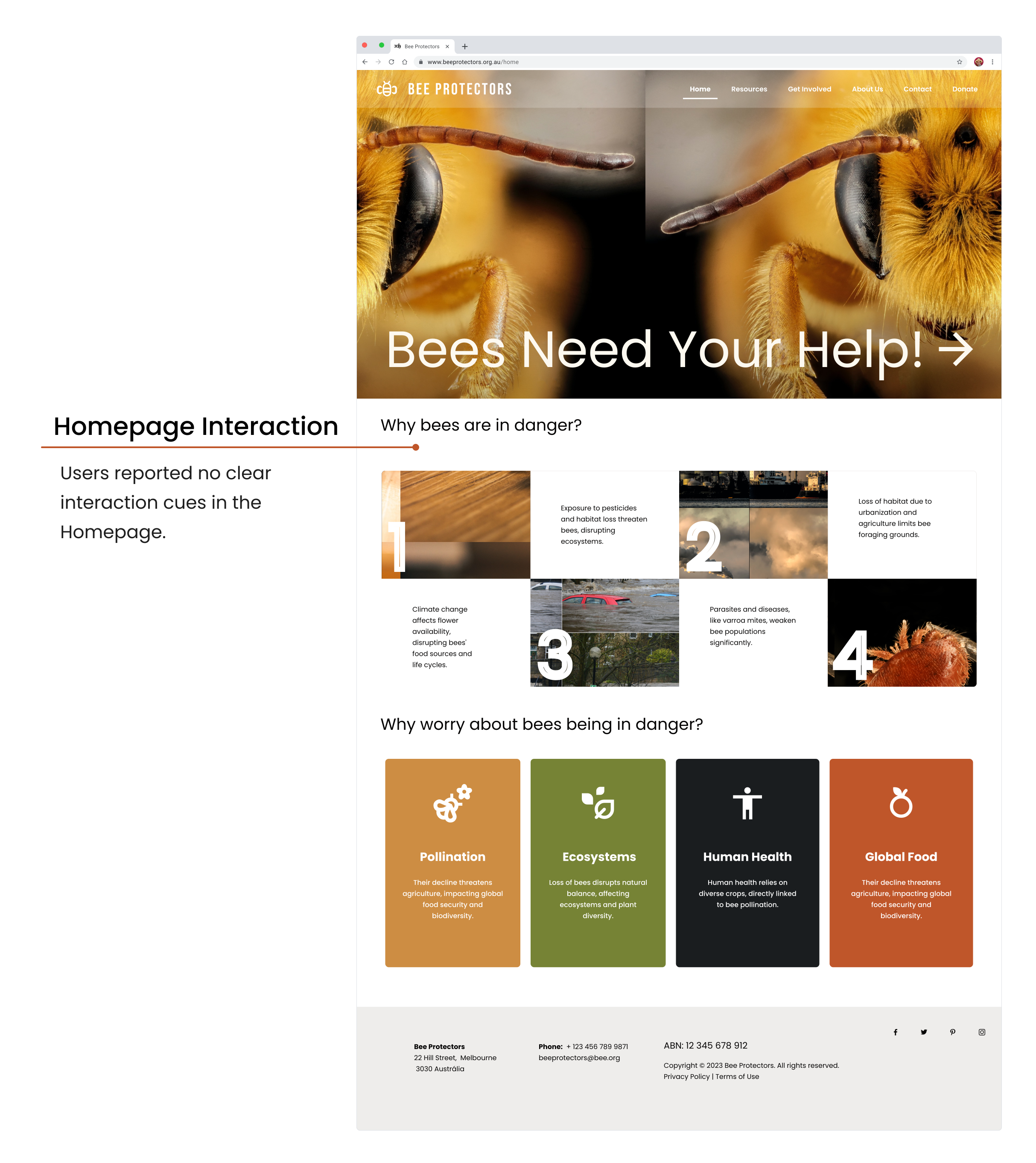
Screenshot of the Bee Protectors homepage highlighting a usability finding. 
                An orange line connects the heading 'Homepage Interaction' and the user feedback 
                'Users reported no clear interaction cues' to the 'Why bees are in danger?' 
                section. This section uses a 2x2 grid with numbered images (1–4) explaining 
                threats like pesticides and climate change, 
                illustrating the lack of visual affordances identified by participants.

Where Am I? (Orientation and Location Awareness Cues)

Finding: Users felt lost when arriving at the site because the navigation bar’s active state did not sufficiently communicate their current location.
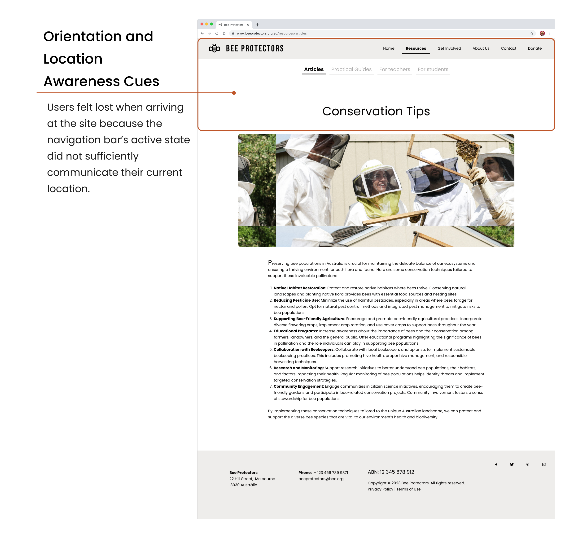
A screenshot of the 'Conservation Tips' page on the Bee Protectors website, 
                illustrating a usability finding on orientation. The main navigation, currently 
                displaying the 'Articles' tab, is enclosed in a red rectangle and connected by a 
                red line to a text block titled 'Orientation and Location Awareness Cues.
                ' This text states that 'Users became lost upon arriving at the site, indicating 
                the navigation bar’s active state did not clearly inform them of their current location.
                ' Below this highlight, the page contains 
                an image of beekeepers and a list of detailed conservation techniques.

Navigation Bar Structure

Finding: Users questioned the navigation bar's structure, specifically why Students and Teachers were separate menu items instead of being consolidated under a single Educational or Resources heading.
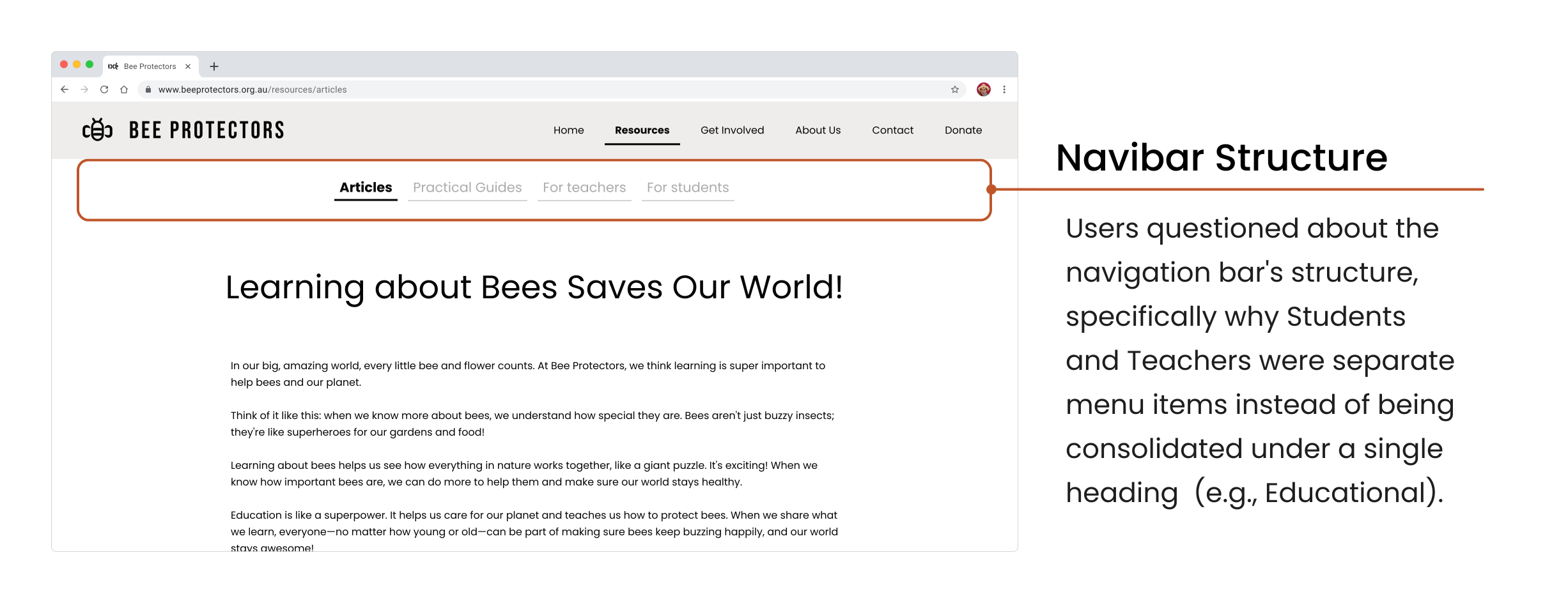
A screenshot of the Bee Protectors website focusing on a usability 
                finding regarding the secondary navigation structure. An orange rectangle 
                highlights the sub-menu containing 'Articles', 'Practical Guides', 
                'For teachers', and 'For students'. A corresponding text block titled 
                'Navigation Bar Structure' explains that users questioned why 'Students' 
                and 'Teachers' were listed as separate menu items rather than 
                being consolidated under a single 'Educational' heading.

Articles Clickable Elements

Finding: Users reported difficulty locating clickable elements on the Article Page.
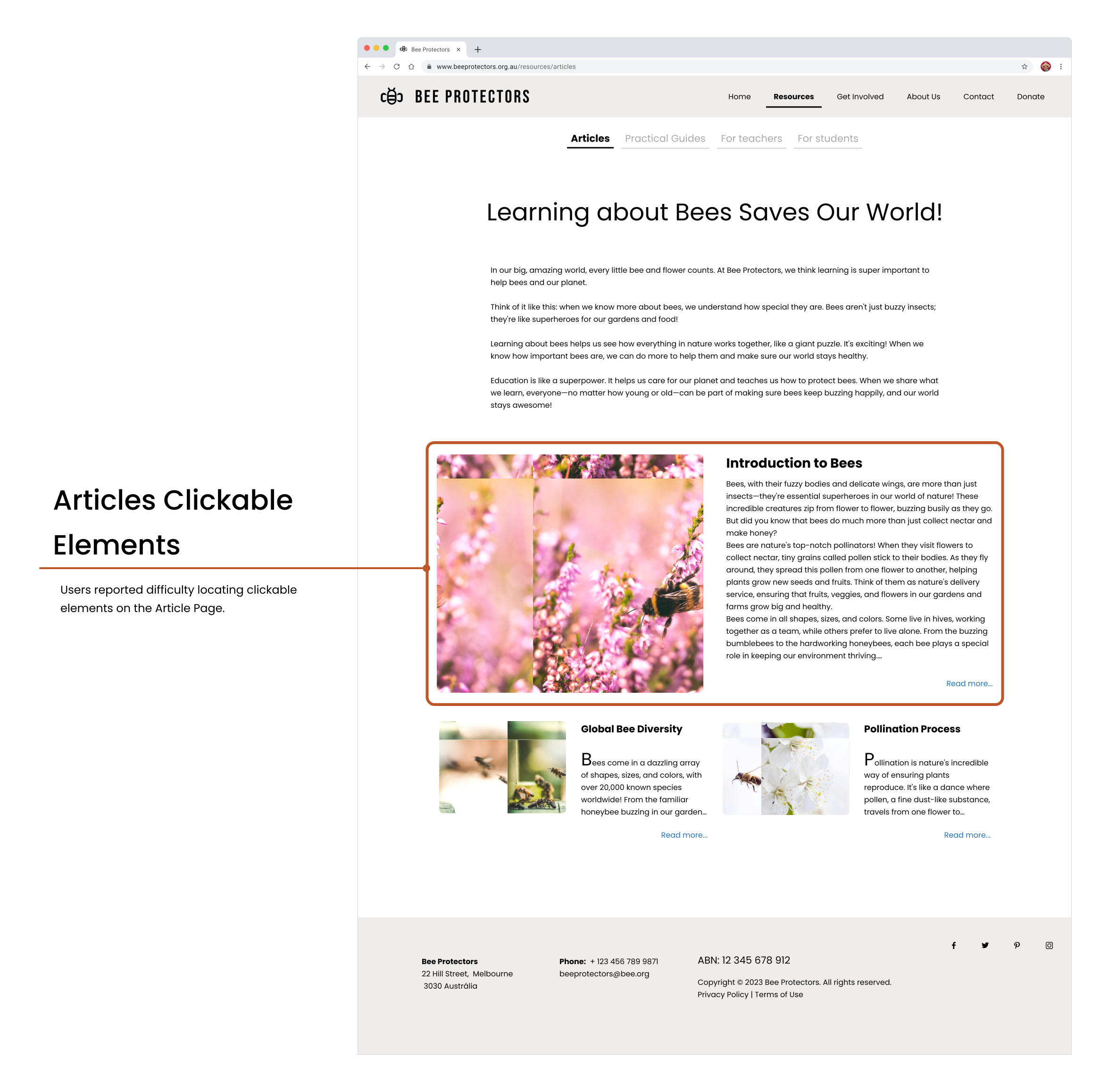
A screenshot of the 'Articles' page on the Bee Protectors website, illustrating a usability 
                finding on interactive design. An orange rectangle encloses the first article card, 
                which is connected by an orange line to a text block titled 'Articles Clickable Elements.
                ' The text notes that 'Users reported difficulty locating clickable elements on the Article 
                Page.' The article card includes an image of a bee, an 
                'Introduction to Bees' heading, and a 'Read more...' link in the bottom right corner.

Image Perception

Findings: The current bee image on the website evoked fear among users, highlighting a critical need for a more positive and welcoming visual experience.
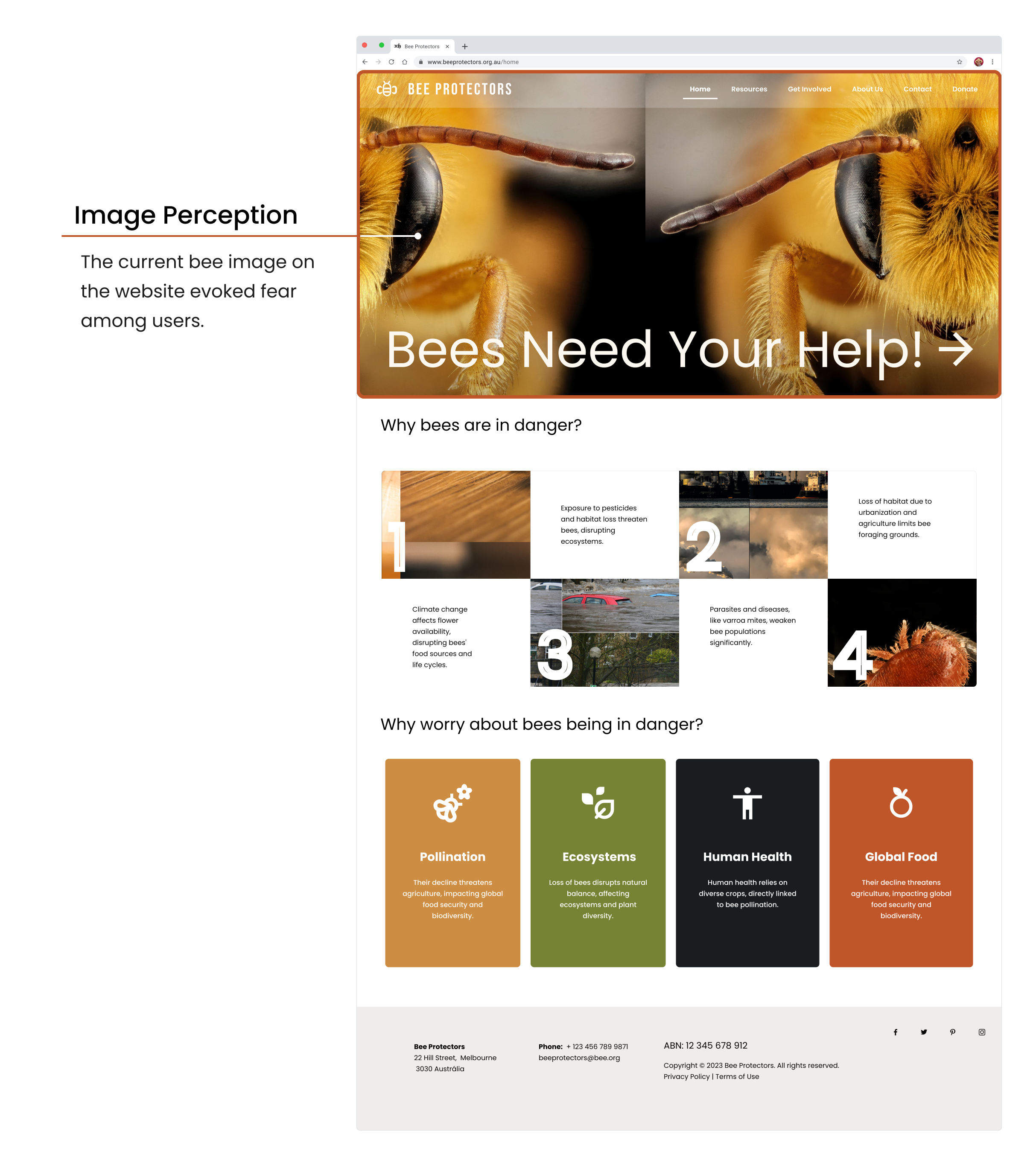
A screenshot of the Bee Protectors homepage illustrating a usability finding regarding 
                image perception. An orange line connects a text block titled 'Image Perception' to the 
                large hero image of a bee's face. The text states: 'The current bee image on the website 
                evoked fear among users.' Below this, the website layout includes sections titled 'Why bees are 
                in danger?' and 'Why worry about bees being in danger?' with various informational cards.

Article's Scanning Difficulty

Findings: Users had difficulty scanning and understanding content when paragraphs lacked clear headings, indicating that titles are crucial for guiding text navigation, enhancing readability, and improving information retrieval.

A screenshot of the 'Creating Bee-Friendly Urban Gardens' article on the Bee Protectors website. 
                An orange rectangle encloses a dense block of text, connected by an orange line to a 
                finding titled 'Article's Scanning Difficulty.' The text explains that users struggled 
                to scan and understand content when paragraphs lacked clear headings, highlighting 
                the need for titles to guide navigation and improve information retrieval.

Task Completion with Card Options

Findings: Users successfully completed tasks when information was presented in card-based options, indicating this format is highly effective for guiding choices and facilitating task completion.

A screenshot of the 'Get Involved' page on the Bee Protectors website. An orange rectangle 
                  encloses two informational cards for 'Volunteer' and 'Fundraising,' connected by 
                  an orange line to a finding titled 'Task Completion with Card Options.
                  ' The text notes that users successfully completed tasks when information 
                  was presented in this format, 
                  indicating it is highly effective for guiding choices.

Hi-Fidelity Prototype | Action Plan

Action Plan is prioritized list of design changes and tasks based on usability feedback, aiming to improve the usability of the product.

For each one of the seven key findings identified a corresponding action was developed, as listed below:

Hi-Fidelity Finding Action
Homepage Refinement Homepage Redesign
Where Am I? (Orientation and Location Awareness Cues) Implement Wayfinding Features
Navigation Bar Structure Navigation Structural Redesign
Articles Clickable Elements Articles, Lesson Plan, and Practical Guides Portal Adoption
Image Perception Imagery Update
Article's Scanning Difficulty Articles Page Redesign
Task Completion with Card Card-Based Portals
Action Plan Detail: Findings and Design Solutions

Action Item: 01

Finding: Homepage Refinement

Users reported no clear interaction cues in the Homepage.

Solution: Homepage Redesign

The Homepage will transition from an expository style to a more interactive one. It will feature a prominent hero section displaying a compelling tagline and clear call-to-action (CTA). Additionally, it will include interactive sections and cards for key options of Get Involved (Volunteering and Fundraising), Resources, and a simplified Donate card.

Action Item: 02

Finding: Where Am I? (Orientation and Location Awareness Cues)

Users felt lost when arriving at the site because the navigation bar’s active state did not sufficiently communicate their current location.

Solution: Implement Wayfinding Features

Breadcrumbs and interactive section labels will be added to help users understand their location within the site.

Action Item: 03

Finding: Navigation Bar Structure

Users questioned the navigation bar's structure, specifically why Students and Teachers were separate menu items instead of being consolidated under a single Educational or Resources heading.

Solution: Navigation Structural Redesign

Navigation Bar: The separate For Students and For Teachers navigation menu items will be consolidated into a single, clearly labeled parent menu item named Educational.

Footer: The footer will be enhanced by including a shortcut menu mirroring the main navigation to improve findability and interaction.

Action Item: 04

Finding: Articles Clickable Elements

Users reported difficulty locating clickable elements on the Article Page.

Solution: Articles, Lesson Plan, and Practical Guides Portal Adoption

The Articles, Lesson Plans, and Practical Guides pages will each gain a portal displaying cards containing an image, title, publishing date, and estimated reading time. This will aid in scanning the available resources and making a selection.

Action Item: 05

Findings: Image Perception

The current bee image on the website evoked fear among users, highlighting a critical need for a more positive and welcoming visual experience.

Solution: Imagery Update

The imagery will be updated to focus on positive and welcoming visuals, directly addressing the negative emotional response evoked by the current bee image.

Action Item: 06

Findings: Article's Scanning Difficulty

Users had difficulty scanning and understanding content when paragraphs lacked clear headings, indicating that titles are crucial for guiding text navigation, enhancing readability, and improving information retrieval.

Solution: Articles Page Redesign

For the content/reading pages such as Articles, Lesson Plans, and Practical Guides, a summary with a table of contents and author information will be implemented. Crucially, all paragraphs will include headings to facilitate easier scanning and comprehension.

Action Item: 07

Findings: Task Completion with Card Options

Users successfully completed tasks when information was presented in card-based options, indicating this format is highly effective for guiding choices and facilitating task completion.

Improvement: Card-Based Portals

Key pages such as Get Involved, Resources, Educational, Practical Guides, and Articles will display their internal options using an interactive card-based portal system.

Refinements

Refinement is the stage in the Design Thinking process where identified usability issues found during the Test phase are improved.

The improvement process was executed in two distinct stages, aligning with the Low-fidelity and High-fidelity Usability Studies. This systematic approach ensured that user pain points were addressed and implemented at the appropriate point in the design lifecycle.

Low-fidelity | Refinements

The Low-fidelity Usability Study findings indicated that the overall structure and navigation of the website were effective, with users successfully completing tasks and finding information. As a result, no significant changes were necessary at this stage.

Hi-Fidelity Prototype | Refinements

The Action Plan phase resulted seven points for improvements and refinements of the Hi-Fidelity prototype, which were implemented in three steps, first the Information Architecture was refined, followed by the user-flows refinements and improvements closing by the Design Implementation

Information Architecture Refinement

Information Architecture is a structural map of a digital product, illustrating how content is organized, labelled, and navigated to ensure clarity and usability for users.

The website's Information Architecture was refined accordingly to the action plan. Key changes: Top-level pages were reorganized/re-prioritized; For Teachers and For Students these contents were consolidated under Educational; and the Fundraise option Join a Team was rename to Join a Fundraiser for clarity.

Updated Information Architecture
A sitemap diagram showing the hierarchical structure of a website. 
                      The top-level page is 'Home', branching to 'Resources', 'Get Involved', 
                      'Donate', 'About Us', and 'Contact'. 'Resources' includes 'Articles', 
                      'Practical Guides' (with 'Conservational Guide', 'Bee-Friendly Urban Gardens', 
                      'Living in Harmony Guide'), and 'Educational' (with 'Lesson Plan', 
                      'Colouring Pages', 'Bee Fact Quiz'). 'Get Involved' branches to 
                      'Fundraise' ('Start a Fundraise', 'Join a Fundraise') and 'Volunteer' 
                      ('Share your skills', 'Help in our farm', 'Engage to activities'). 
                      'Donate', 'About Us', and 'Contact' have no inner-dividers.
User-Flow Refinement

User Flow is a visual representation of the pathways a user takes to complete tasks within a digital product, illustrating each step and decision point.

This step involved updating existing user flow processes and developing new, detailed flow diagrams for the five critical areas: Articles, Volunteer, Practical Guides, Lesson Plans, and Donation. These flows will serve as the blueprint for the subsequent design and development updates.

Articles Page Access Diagram | User-Flow

This user flow diagram illustrates the proposed paths for accessing Articles content, a new process developed to enhance content discoverability and user guidance based on usability testing.

The diagram details access points from the main menu and the homepage's Resources section, culminating in the ability for users to efficiently read or print the final content.
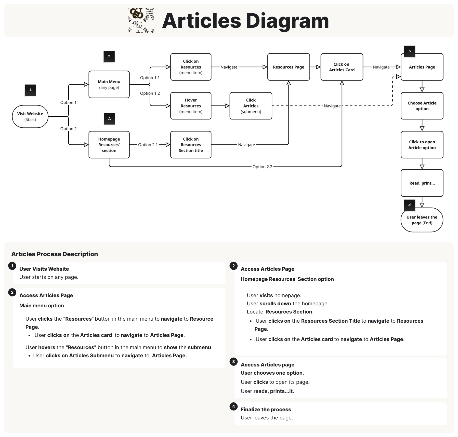
Diagram illustrating the process of accessing articles on a website. 
                  The process begins with 'Visit Website' and branches into two main paths to reach the 'Articles Page'.

                  **Path 1: Through Main Menu**
                  1. From 'Visit Website', user locates 'Main Menu (any page)'.
                  2. User can either 'Click on Resources (menu item)', which navigates to 'Resources Page', and then 'Click on Articles Card' to reach 'Articles Page'.
                  3. Alternatively, user can 'Hover Resources (menu item)' then clicks 'Articles (submenu)', which then navigates to 'Articles Page'.

                  **Path 2: Through Homepage Resources' section**
                  1. From 'Visit Website', user locates to 'Homepage Resources' section'.
                  2. User can either 'Click on Resources Section title', which navigates to 'Resources Page', and then 'Click on Articles Card' to reach 'Articles Page'.
                  3. Alternatively, user can go directly from 'Homepage Resources' section' to 'Articles Page' via 'Option 2.2' (implied shortcut, click on an Articles card within that section).

                  **From 'Articles Page', the process continues:**
                  1. 'Choose Article option'.
                  2. 'Click to open Article option'.
                  3. 'Read, print...'.
                  4. The process concludes with 'User leaves the page (End)'.

                  The image also includes an 'Articles Process Description' providing detailed steps for each stage:

                  **1. User Visits Website**
                    - User starts on any page.

                  **2. Access Articles Page**
                    - **Main menu option:** Describes clicking 'Resources' button to navigate to 'Resource page', then clicking 'Articles card'. Also describes hovering 'Resources' button to show submenu and clicking 'Articles Submenu'.
                    - **Homepage Resources' Section option:** Describes visiting homepage, user locates (scrolling down) to 'Resources Section', clicking 'Resources Section Title' to navigate to 'Resources Page', and then clicking 'Articles card'.

                  **3. Access Articles page**
                    - User choses one option.
                    - User clicks to open its page.
                    - User reads, prints...it.

                  **4. Finalize the process**
                    - User leaves the page.
Volunteer Process Diagram | User-Flow

This user flow outlines a proposed strategy to guide users to the volunteering page, leveraging the existing, efficient email-based system to minimize development costs and streamline internal user adoption.

It clearly outlines opportunities and how to get involved, accessible via the volunteering page or homepage volunteer section.
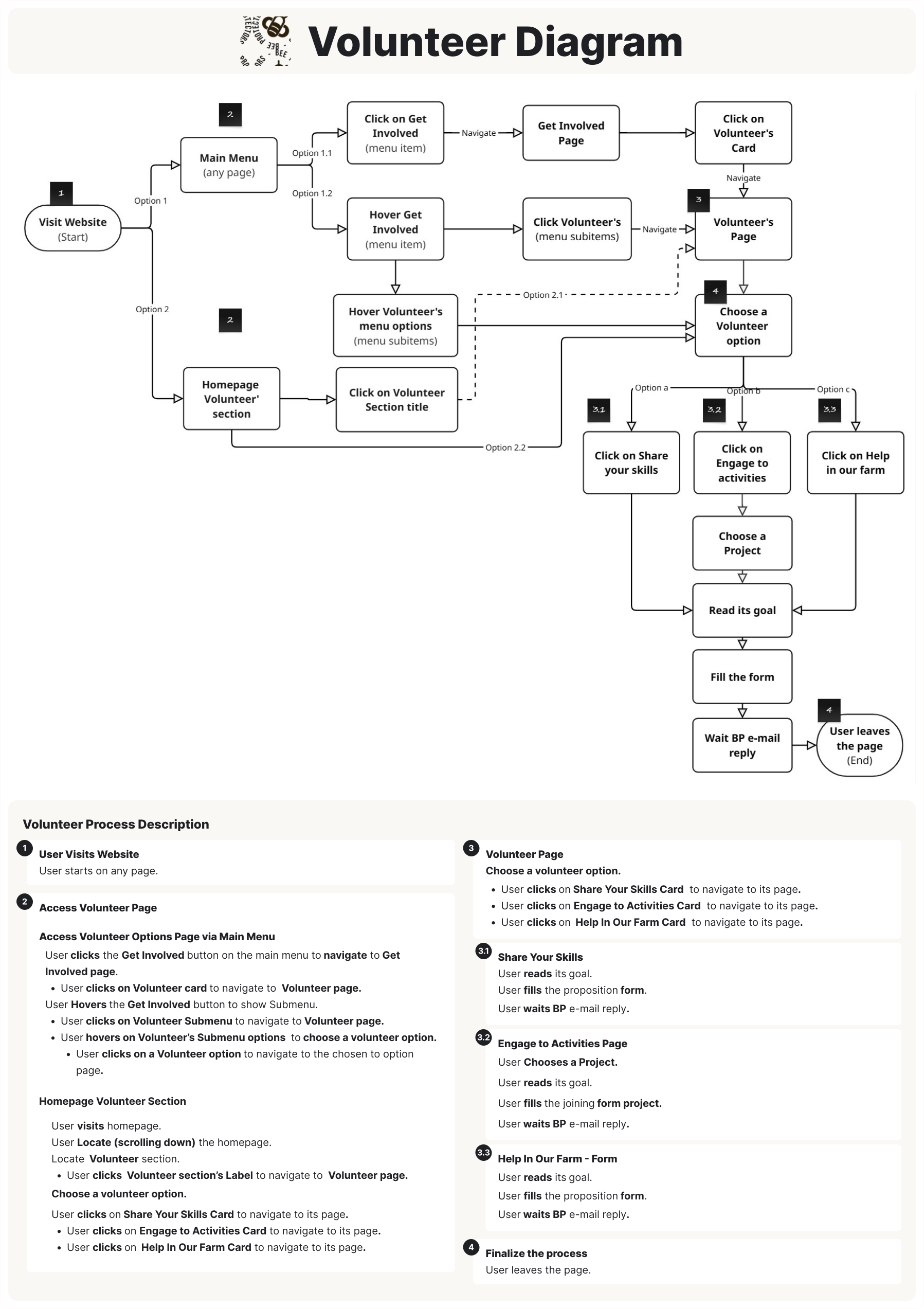
Diagram illustrating the process of becoming a volunteer on a website. The process begins with 'Visit Website' and branches into two main paths to access volunteer options.

**Path 1: Through Main Menu**
1. From 'Visit Website', user locates 'Main Menu (any page)'.
2. User can either 'Click on Get Involved (menu item)' leading to 'Get Involved Page' and then clicks on 'Volunteers Card' to reach 'Volunteer's Page'.
3. Alternatively, users can 'Hover Get Involved (menu item)' then'Click Volunteer's (menu submenu)', which then navigates to 'Volunteer's Page'.

**Path 2: Through Homepage Volunteer section**
1. From 'Visit Website', user locates 'Homepage Volunteer section'.
2. User can 'Click on Volunteer Section title' to go directly to 'Volunteer's Page'.
3. Alternatively, user can 'Click on Volunteer Section title' to go directly to 'Volunteer's Page'.
4. Alternatively, User can either choose a Volunteer option (a card, option shortcut).

**From 'Volunteer Section (card shortcut)' or'Volunteer's Page', user chooses a 'Volunteer option', which can be one of three choices:**
1. 'Click on Share your skills'.
2. 'Click on Engage in Activities' (which then leads to 'Choose a Project').
3. 'Click on Help in our farm'.

**All chosen volunteer paths converge to:**
1. 'Read its goal'.
2. 'Fill the form'.
3. 'Wait BP e-mail reply'.

The process concludes with 'User leaves the page (End)'.

The image also includes a 'Volunteer Process Description' providing detailed steps for each stage:

**1. User Visits Website**
   - User starts on any page.

**2. Access Volunteer Page**
   - **Access Volunteer Options Page via Main Menu:** Describes clicking 'Get Involved' button, hovering for submenu, and clicking specific options to reach the Volunteer page.
   - **Homepage Volunteer Section:** Describes navigating from the homepage, locating the section, and clicking titles or cards to reach volunteer options.

**3. Volunteer Page**
   - Describes choosing a volunteer option by clicking on 'Share Your Skills Card', 'Engage in Activities Card', or 'Help in the Farm Card'.

**4. Share your Skills**
   - User reads goal, fills form, and waits for email reply.

**5. Engage to Activities Page**
   - User chooses project, reads goal, fills joining form, and waits for email reply.

**6. Help in Our Farm - Form**
   - User reads goal, fills proposition form, and waits for email reply.

**7. Finalize the process**
   - User leaves the page.
Donate Process Diagram | User-Flow

The donation user flow was structured for efficiency, allowing users to access options via the main menu or the homepage Donate shortcut card.

The existing system (donate.com or direct deposit) was retained to minimize costs.

To facilitate mobile contributions, a QR code linking to the donation website was added, guiding users to complete their payment or continue exploring.
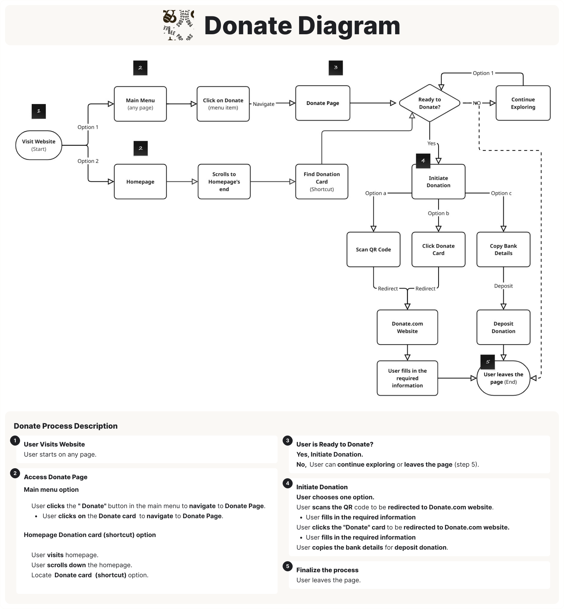
Diagram illustrating the donation process on a website. The process begins with 'Visit Website' and branches into two main paths to access the 'Donate Page'.

**Path 1: Through Main Menu**
1. From 'Visit Website', user locates 'Main Menu (any page)'.
2. 'Click on Donate (menu item)' to navigate to 'Donate Page'.

**Path 2: Through Homepage Donation section**
1. From 'Visit Website', navigate to 'Homepage'.
2. 'Scrolls to Homepage's end'.
3. 'Find Donation Card (Shortcut)' The user encounters a decision point: 'Ready to Donate?'
    * If 'No', the user can 'Continue Exploring' or proceed to 'User leaves the page (End)'.
    * If 'Yes', the user proceeds to 'Initiate Donation'.

**From 'Donate Page', the process continues:**
1. The user encounters a decision point: 'Ready to Donate?'
    * If 'No', the user can 'Continue Exploring' or proceed to 'User leaves the page (End)'.
    * If 'Yes', the user proceeds to 'Initiate Donation'.

**From 'Initiate Donation', there are three options to proceed:**
1. 'Option a': 'Scan QR Code', which 'Redirects' to 'Donate.com Website'.
2. 'Option b': 'Click Donate Card', which also 'Redirects' to 'Donate.com Website'.
3. 'Option c': 'Copy Bank Details', which leads to 'Deposit Donation'.

**After either redirecting to 'Donate.com Website' or 'Deposit Donation':**
1. 'User fills in the required information'.
2. The process concludes with 'User leaves the page (End)'.

The image also includes a 'Donate Process Description' providing detailed steps for each stage:

**1. User Visits Website**
   - User starts on any page.

**2. Access Donate Page**
   - **Main menu option:** Describes clicking the 'Donate' button in the main menu to navigate to 'Donate Page'.
   - **Homepage Donation card (shortcut) option:** Describes visiting the homepage, scrolling down, locating the 'Donate card (shortcut) option'.

**3. User is Ready to Donate?**
   - Yes, Initiate Donation.
   - No, User can continue exploring or leaves the page (step 5).

**4. Initiate Donation**
   - User selects one option.
   - User scans the QR code to be redirected to Donate.com website.
   - User fills in the required information.
   - User clicks the 'Donate' card to be redirected to Donate.com website.
   - User fills in the required information.
   - User copies the bank details for deposit donation.

**5. Finalize the process**
   - User leaves the page.
Practical Guides Page Access Diagram | User-Flow

This diagram outlines the proposed user path to Practical Guides, a new process developed in response to user research findings to improve access and discoverability.

Users can now access the guides quickly and intuitively via the main menu, the homepage Resources section, or a direct shortcut, highlighting various efficient entry points and available choices.
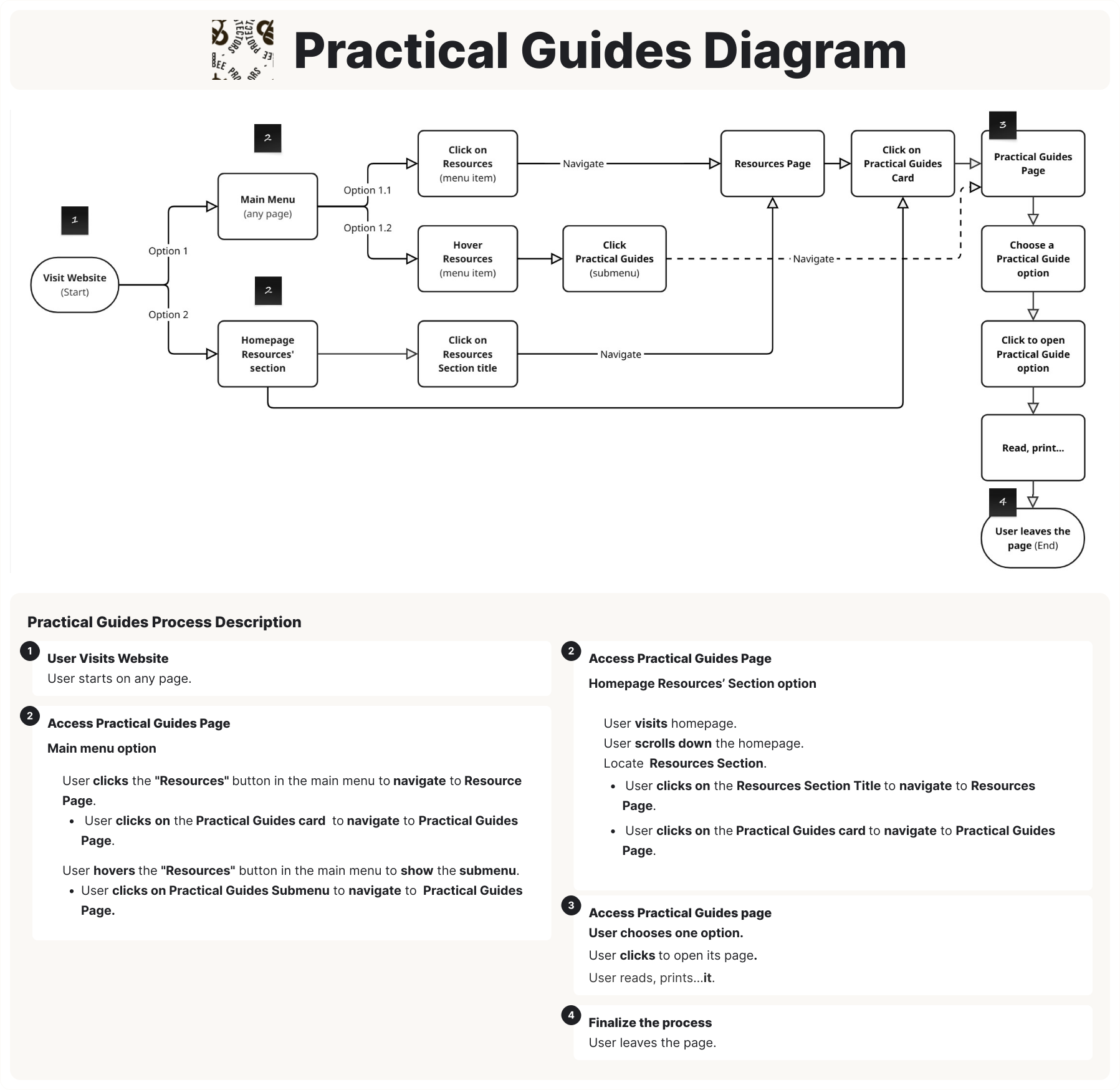
Diagram illustrating the process of accessing practical guides on a website. The process begins with 'Visit Website' and branches into two main paths to reach the 'Practical Guides Page'.

**Path 1: Through Main Menu**
1. From 'Visit Website', user locates 'Main Menu (any page)'.
2. User can either 'Click on Resources (menu item)', which navigates to 'Resources Page', and then 'Click on Practical Guides Card' to reach 'Practical Guides Page'.
3. Alternatively, user can 'Hover Resources (menu item)' to reveal 'Click Practical Guides (submenu)', which then navigates to 'Practical Guides Page'.

**Path 2: Through Homepage Resources' section**
1. From 'Visit Website', navigate to 'Homepage Resources' section'.
2. User can either 'Click on Resources Section title', which navigates to 'Resources Page', and then 'Click on Practical Guides Card' to reach 'Practical Guides Page'.
3. Alternatively, user can go directly from 'Homepage Resources' section' to 'Practical Guides Page' (implied shortcut, users clicks on a Practical Guides card within that section).

**From 'Practical Guides Page', the process continues:**
1. 'Choose a Practical Guide option'.
2. 'Click to open Practical Guide option'.
3. 'Read, print...'.
4. The process concludes with 'User leaves the page (End)'.

The image also includes a 'Practical Guides Process Description' providing detailed steps for each stage:

**1. User Visits Website**
   - User starts on any page.

**2. Access Practical Guides Page**
   - **Main menu option:** Describes clicking the 'Resources' button in the main menu to navigate to 'Resource Page', then clicking 'Practical Guides card'. Also describes hovering the 'Resources' button to show the submenu and clicking 'Practical Guides Submenu'.
   - **Homepage Resources' Section option:** Describes visiting homepage, scrolling down to locate 'Resources Section', then clicking 'Resources Section Title' to navigate to 'Resources Page', and then clicking 'Practical Guides card'.

**3. Access Practical Guides page**
   - User chooses one option.
   - User clicks to open its page.
   - User reads, prints...it.

**4. Finalize the process**
   - User leaves the page.
Lesson Plan Access Diagram | User-Flow

This user flow outlines the proposed path to Lesson Plan options, a new process developed in response to user research findings to streamline user access and navigation.

It highlights various entry points and available choices, such as the main menu, the homepage Resources section, or a direct shortcut, making materials quick and easy for users to find.
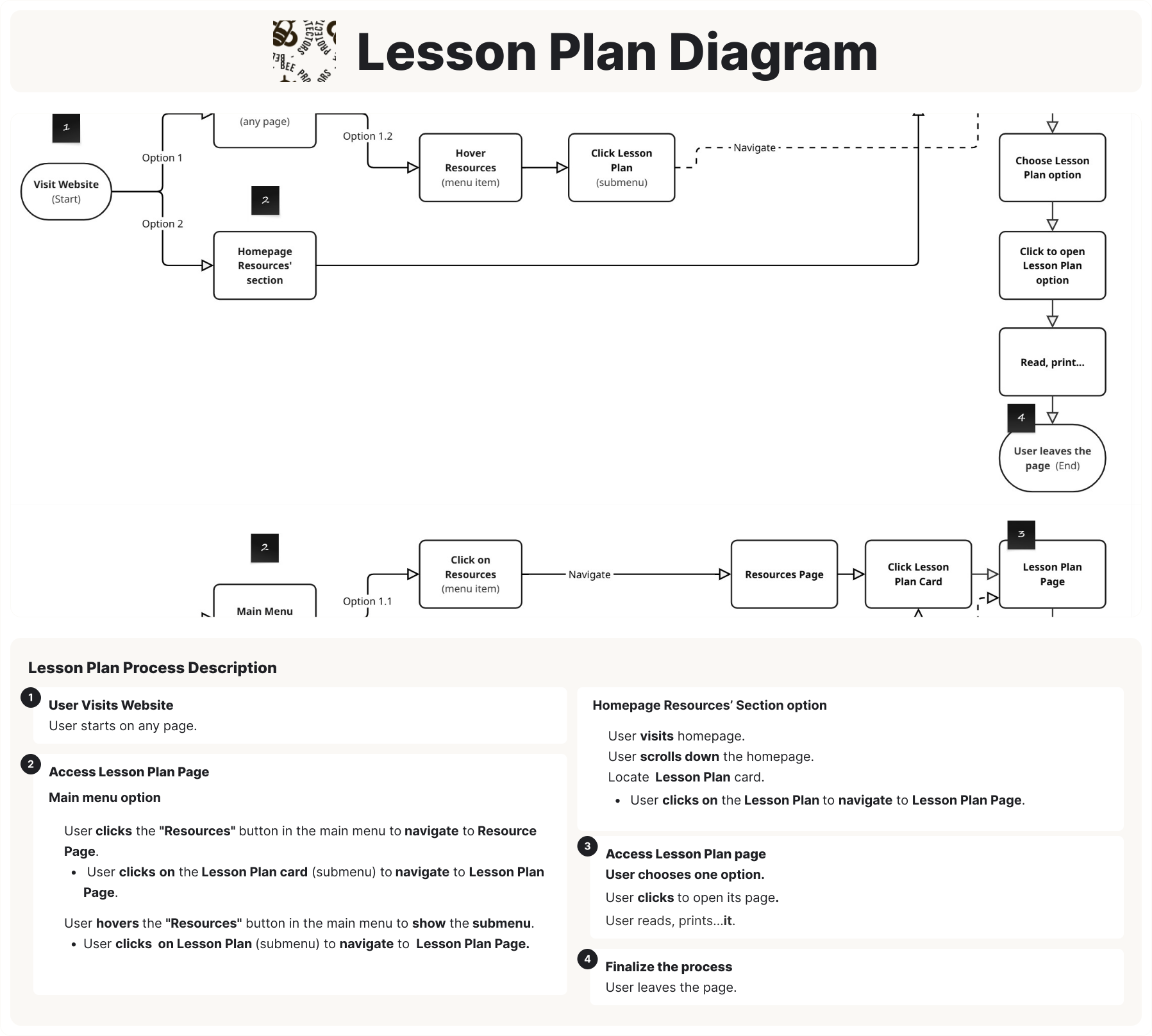
Diagram illustrating the process of accessing lesson plans on a website. The process begins with 'Visit Website' and branches into two main paths to reach the 'Lesson Plan Page'.

**Path 1: Through Main Menu**
1. From 'Visit Website',  user locates 'Main Menu (any page)'.
2. User can either 'Click on Resources (menu item)', which navigates to 'Resources Page', and then 'Click Lesson Plan Card' to reach 'Lesson Plan Page'.
3. Alternatively, user can 'Hover Resources (menu item)' then 'Click Lesson Plan (submenu)', which then navigates to 'Lesson Plan Page'.

**Path 2: Through Homepage Resources' section**
1. From 'Visit Website', navigate to 'Homepage Resources' section'.
2. Users can go directly from 'Homepage Resources' section' to 'Lesson Plan Page' (implied shortcut, likely clicking a Lesson Plan card within that section).

**From 'Lesson Plan Page', the process continues:**
1. 'Choose Lesson Plan option'.
2. 'Click to open Lesson Plan option'.
3. 'Read, print...'.
4. The process concludes with 'User leaves the page (End)'.

The image also includes a 'Lesson Plan Process Description' providing detailed steps for each stage:

**1. User Visits Website**
   - User starts on any page.

**2. Access Lesson Plan Page**
   - **Main menu option:** Describes clicking the 'Resources' button in the main menu to navigate to 'Resource Page', then clicking 'Lesson Plan Card (submenu)'. Also describes hovering the 'Resources' button to show the submenu and clicking 'Lesson Plan (submenu)'.
   - **Homepage Resources' Section option:** Describes visiting homepage, scrolling down to 'Homepage Resources' section', locating 'Lesson Plan card', and then clicking 'Lesson Plan' to navigate to 'Lesson Plan Page'.

**3. Access Lesson Plan page**
   - User chooses one option.
   - User clicks to open its page.
   - User reads, prints...it.

**4. Finalize the process**
   - User leaves the page.
Design Refinements

Following the action plan, we implemented refinements for all seven key areas: Homepage Redesign, Wayfinding Features, Navigation Structural Redesign, Article Portal Redesign, Imagery Update, Articles Page Redesign, and Card-Based Portals.

Homepage Redesign | Design Refinement

The homepage was redesigned to feature a hero section with a compelling tagline, a clear Call-to-Action (CTA), and an image depicting bees in their natural environment.

Below this, interactable sections allow users to navigate to dedicated pages featuring interactive cards for key actions, including Volunteering, Fundraising, Resources, and a simplified Donate option.

Finally, the footer was enhanced with a shortcut menu mirroring the main navigation to improve overall findability and interaction.
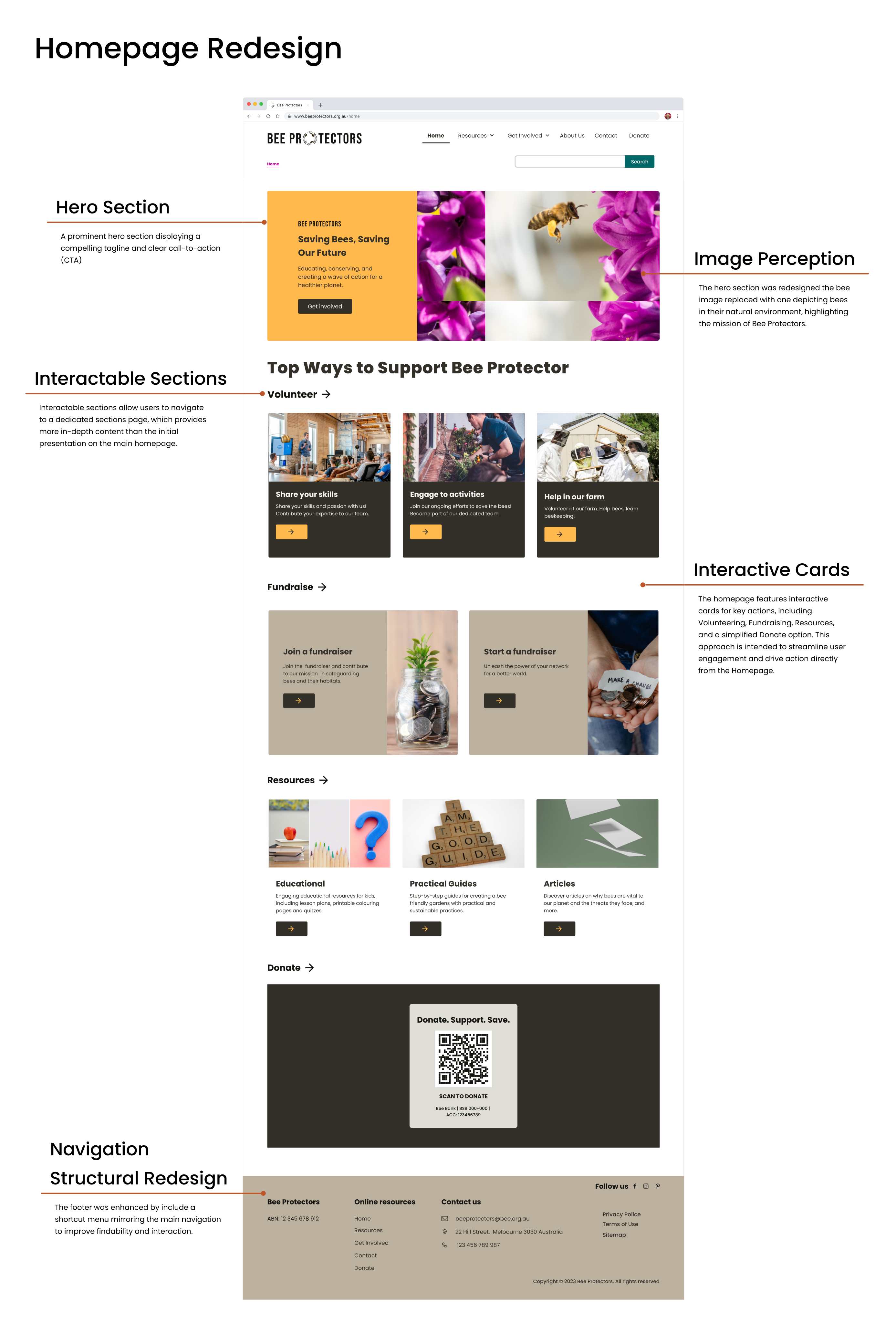
A screenshot of the Bee Protectors 'Homepage Redesign,' detailing four key UI/UX 
                      improvements. The 'Hero Section' features a new bee image in a natural habitat with 
                      a clear 'Get Involved' call-to-action. 'Interactable Sections' and 'Interactive Cards' 
                      show organized categories for Volunteering, Fundraising, and Resources with explicit 
                      buttons to improve interaction cues. Finally, the 
                      'Navigation Structural Redesign' highlights an enhanced footer with a shortcut menu 
                      to improve findability and site orientation.
Wayfinding Features | Design Refinement

Breadcrumb navigation was added to pages for enhancing orientation and improve navigation.
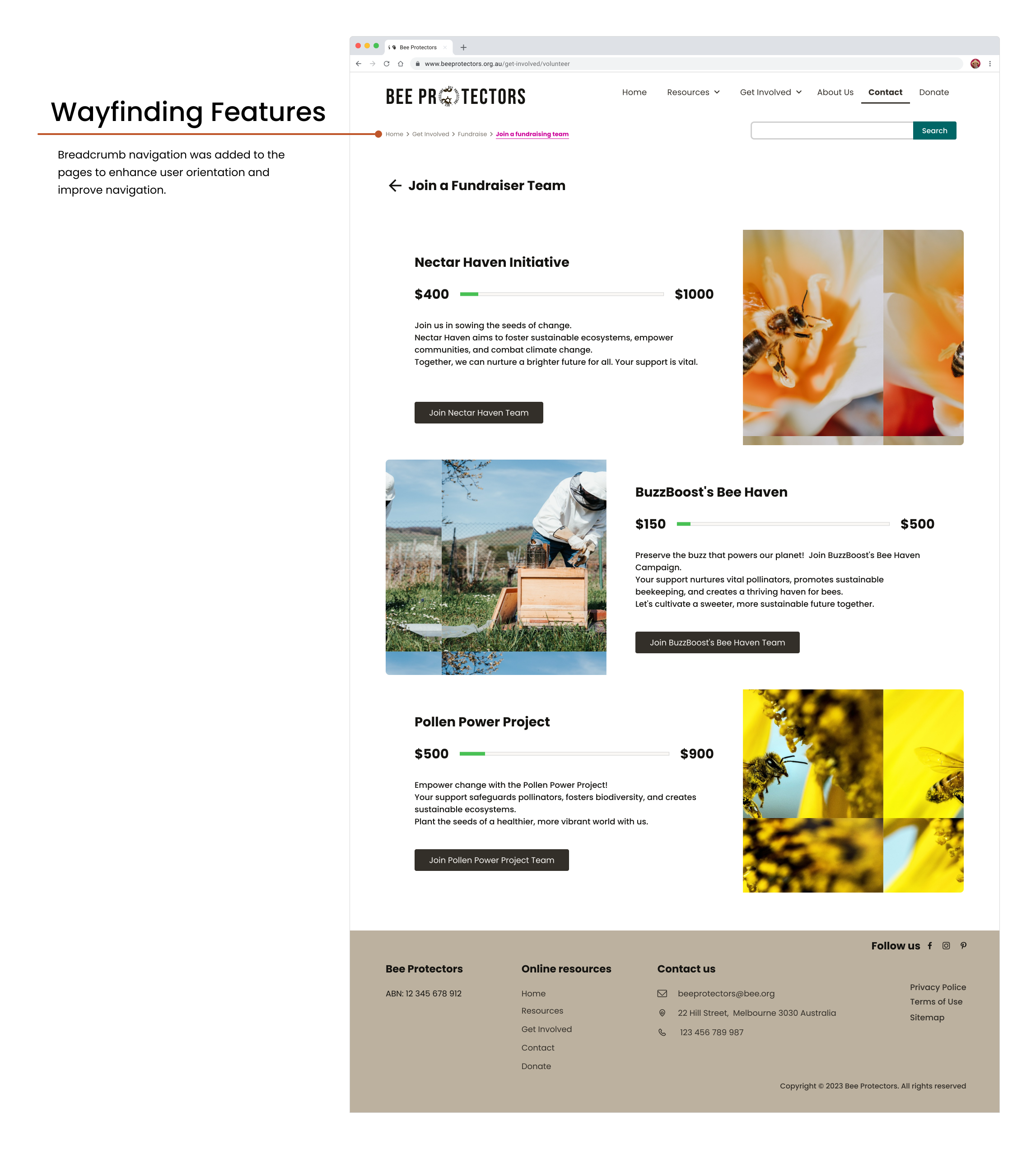
A screenshot of the Bee Protectors 'Join a Fundraiser Team' page highlighting a UX improvement. An orange line connects a text block titled 'Wayfinding Features' to the newly added breadcrumb navigation at the top of the page. The text explains that breadcrumbs were added to enhance user orientation and improve navigation, addressing previous findings where users felt lost within the site hierarchy.
Navigation Structural Redesign | Design Refinement

Breadcrumb navigation was added to pages for enhancing orientation and improve navigation.
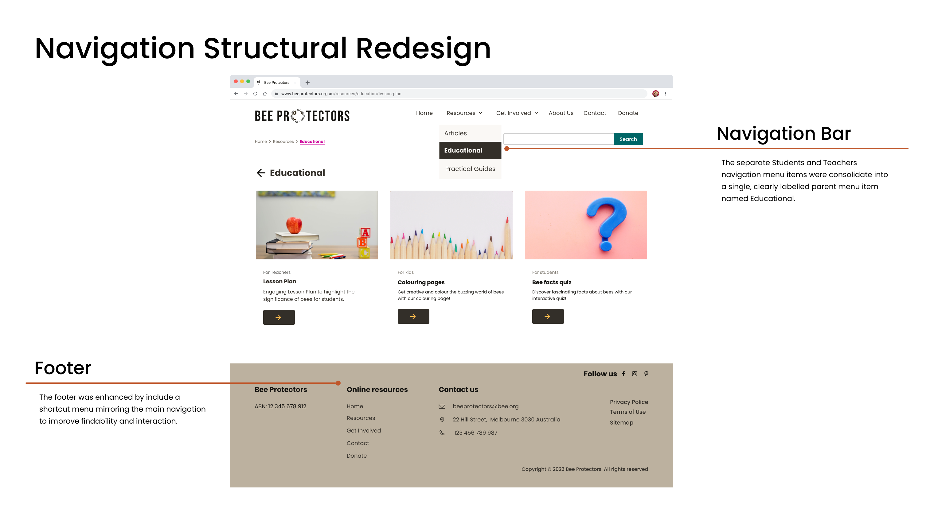
A screenshot of the Bee Protectors 'Navigation Structural Redesign' page. An orange line connects the 'Navigation Bar' callout to a dropdown menu where 'Educational' is selected. The text explains that separate menu items for Students and Teachers were consolidated into this single parent menu. Another line connects the 'Footer' callout to the bottom of the page, noting it was enhanced with a shortcut menu mirroring the main navigation to improve findability.
Articles, Lesson Plan, and Practical Guides Portal Adoption | Design Refinement

The Articles, Practical Guides and Lesson Plan Pages utilises a portal layout that serves as a central gateway to all available content.

This Content Portal features a filter tool and a set of horizontal content cards.

Each card provides users with a quick overview, including an image, title, publication date, and estimated reading time.
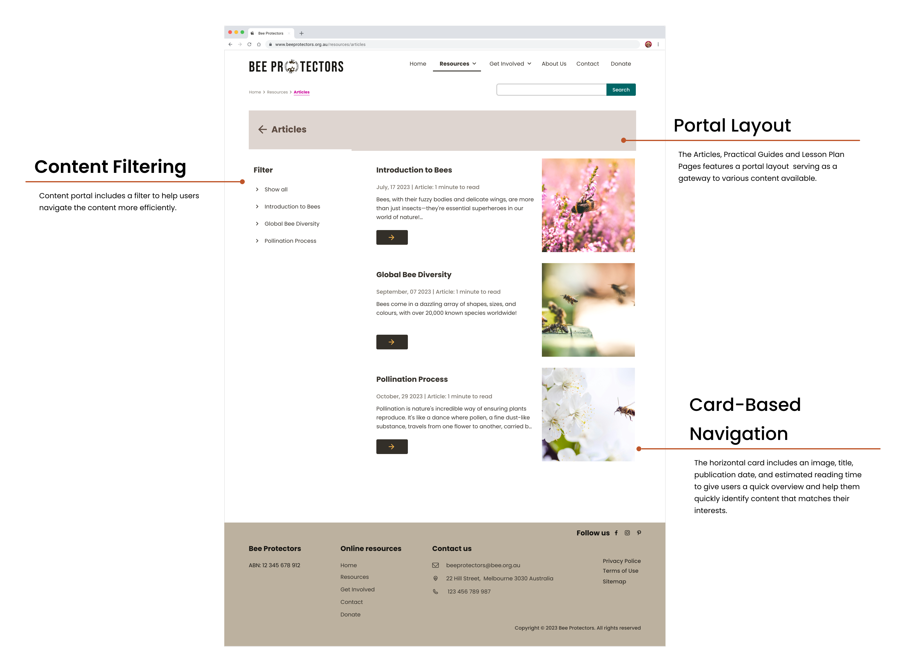
A screenshot of the Bee Protectors 'Articles' page illustrating three key UX design features. An orange line connects 'Content Filtering' to a sidebar menu, noting it helps users navigate content efficiently. Another line connects 'Portal Layout' to the main header, describing it as a gateway to various content. A third line connects 'Card-Based Navigation' to a horizontal article card, highlighting that the use of images, titles, and reading times helps users quickly identify relevant content.
Imagery Update | Design Refinement

The imagery was updated to focus on positive and welcoming visuals, depicting bees in their natural environment, highlighting the mission of Bee Protectors.
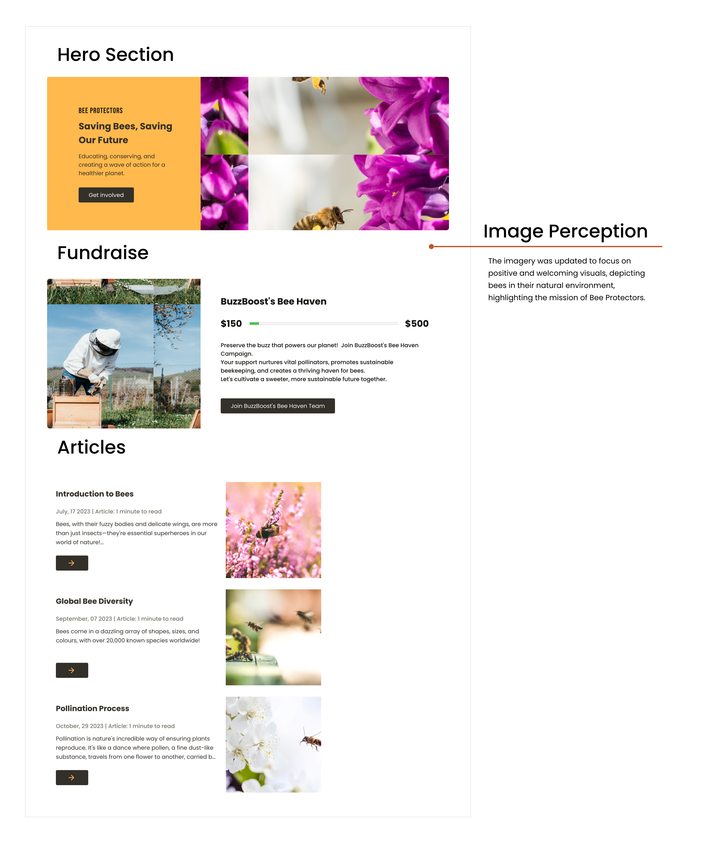
A breakdown of the redesigned homepage sections focusing on image perception. The 'Hero Section' features a welcoming bee image in a natural habitat, while the 'Fundraise' and 'Articles' sections utilise horizontal card-based navigation with explicit interaction buttons to guide the user journey.
Articles Page Redesign | Design Refinement

The Articles Page utilises a portal layout that serves as a central gateway to all available article content.

This Content Portal features a filter tool and a set of horizontal content cards.

Each card provides users with a quick overview, including an image, title, publication date, and estimated reading time.
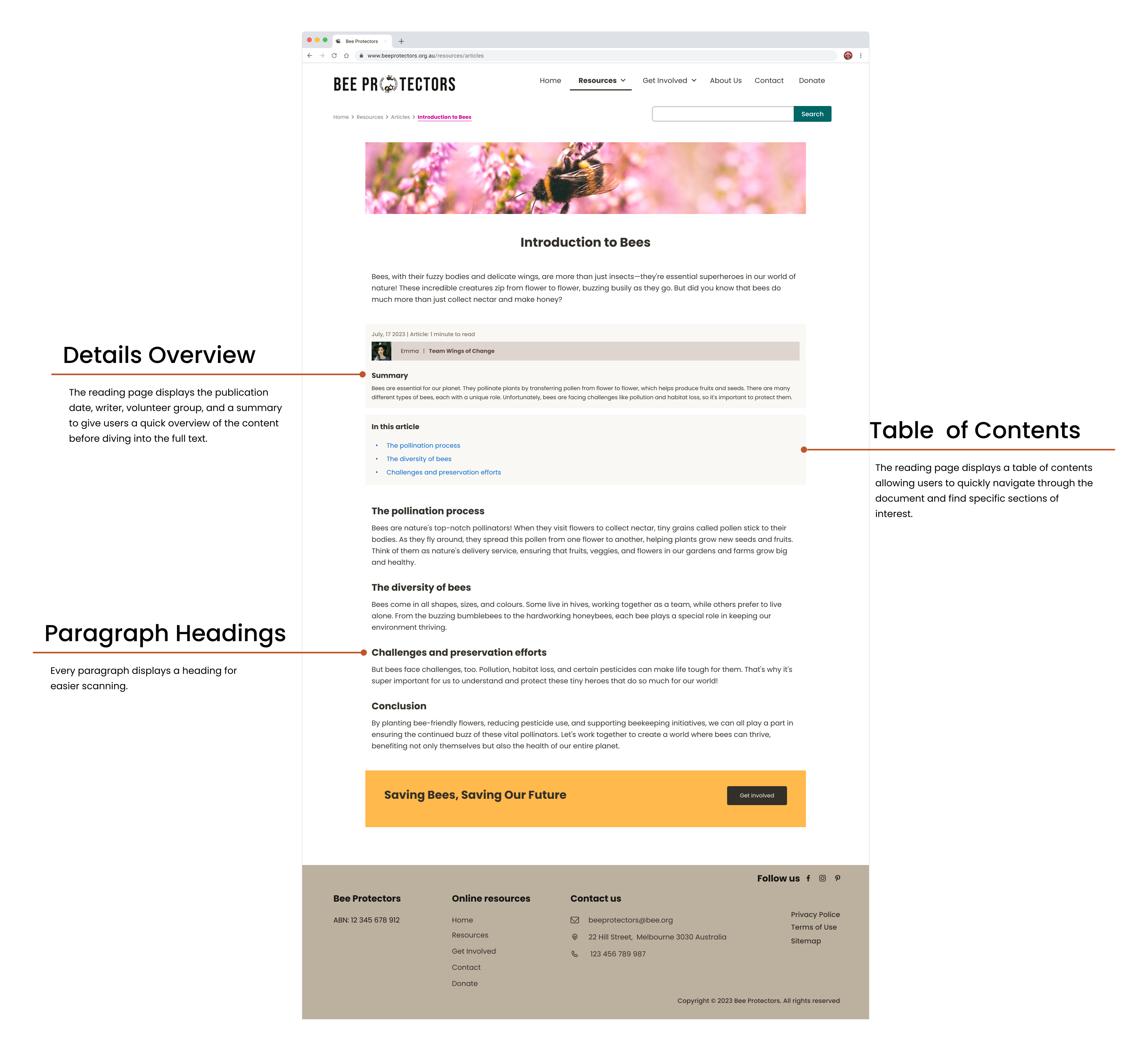
A screenshot of the 'Introduction to Bees' article page optimized for readability. Annotations highlight a 'Details Overview' with metadata, a 'Table of Contents' for quick navigation, and the use of 'Paragraph Headings' to facilitate easier content scanning.
Card-Based Portals | Design Refinement

Key pages such as Get Involved, Resources, Educational, Practical Guides, and Article will display their internal options using an interactive card-based portal system.
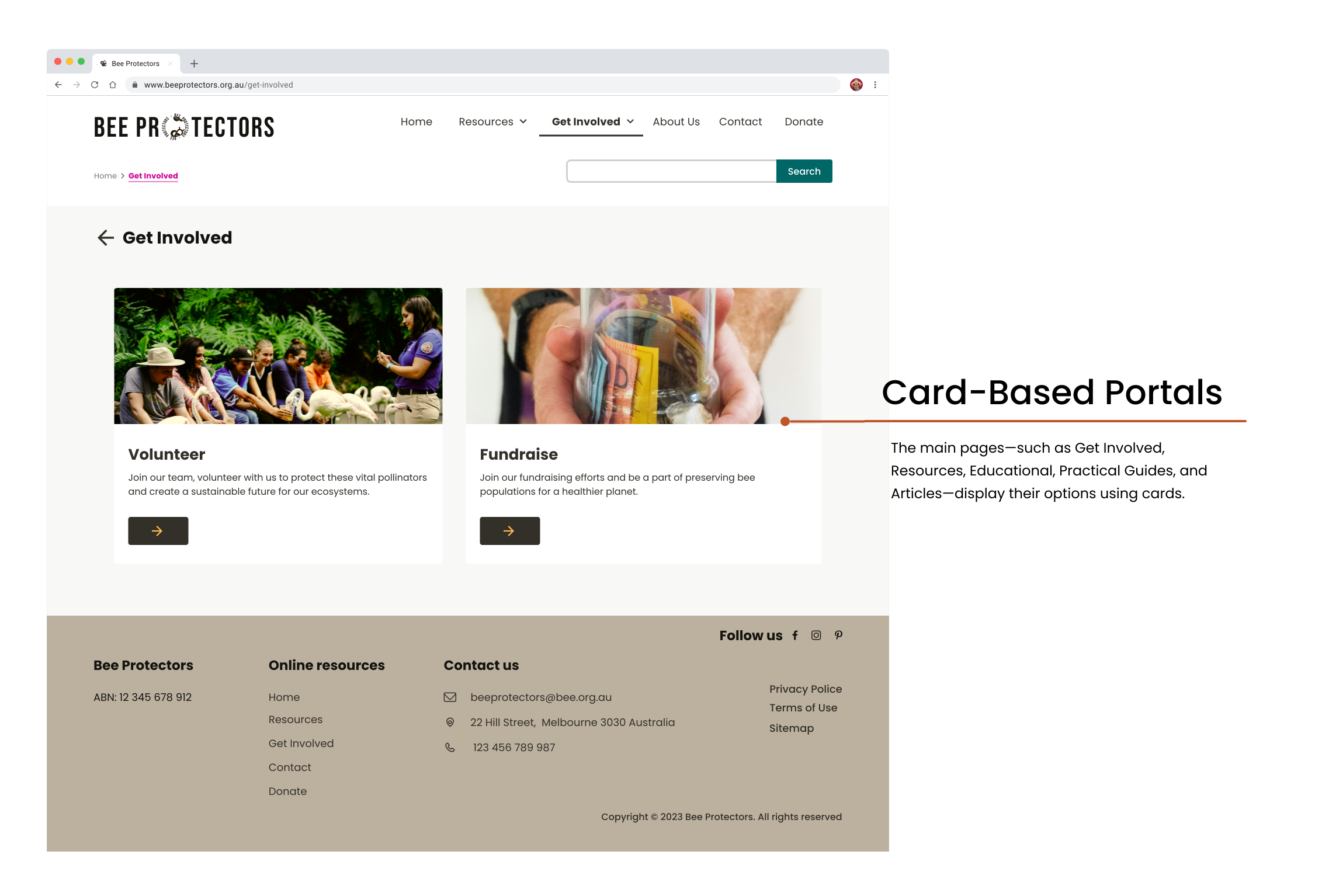
The 'Get Involved' landing page showing card-based portals for Volunteering and Fundraising. The text explains that this consistent card format across main pages helps streamline user choices and facilitates easier task completion.

Accessibility considerations

Accessibility in digital products focuses on ensuring usability for individuals with diverse abilities, visually representing features that accommodate various needs and promote inclusivity.

This website prioritizes accessibility for all users, including those with disabilities, through design adherence to WCAG 2.1 AA contrast guidelines and providing meaningful text alternatives for images. Its clear navigation and actionable sections (Volunteer, Fundraise, Resources) ensure easy engagement.
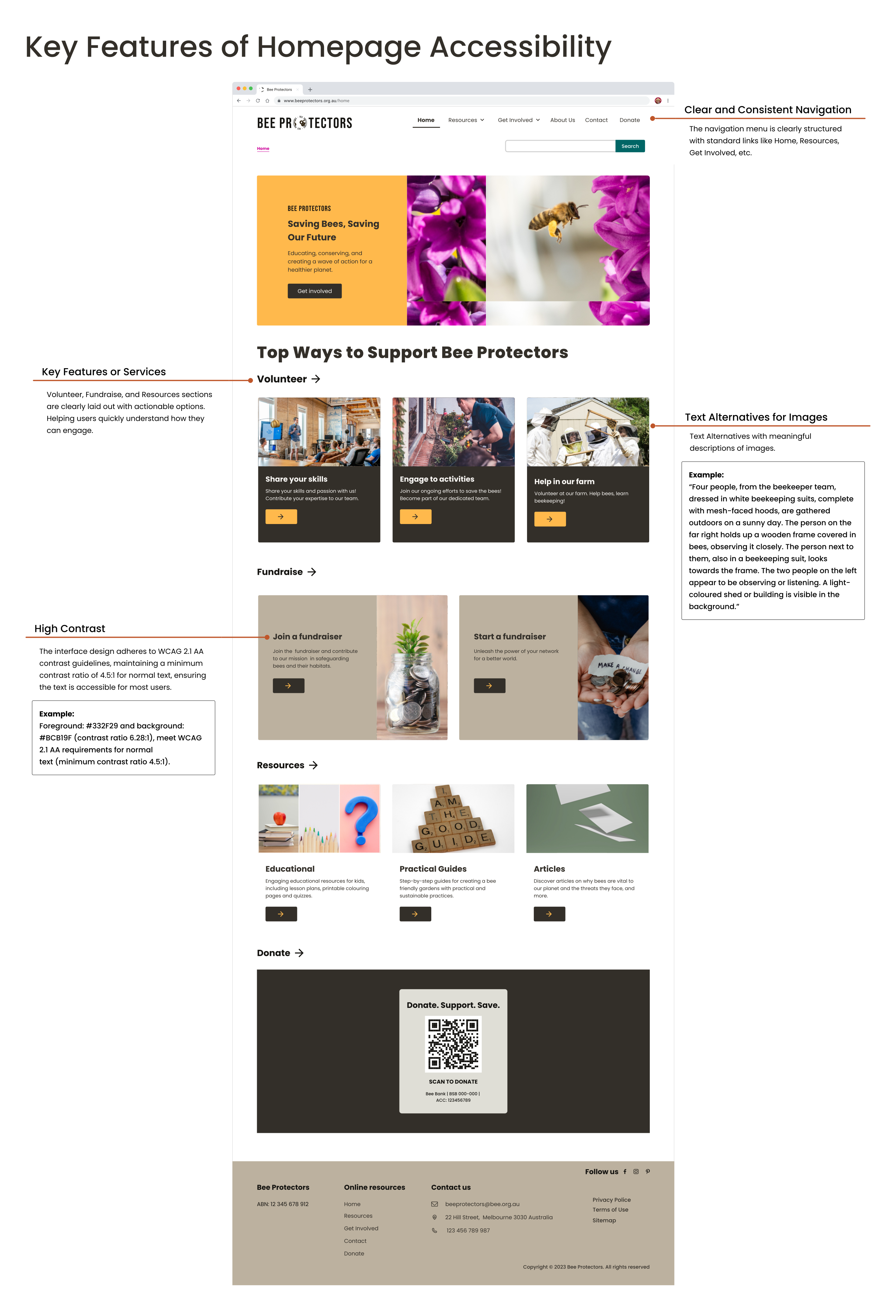
A comprehensive overview of the Bee Protectors homepage redesign, highlighting accessibility features. Callouts identify the 'Clear and Consistent Navigation' menu, 'Key Features or Services' using actionable cards, and 'High Contrast' text following WCAG 2.1 AA standards. A specific example of 'Text Alternatives for Images' is shown, providing a detailed descriptive example for a photo of beekeepers.

Final prototype

This hi-fidelity prototype is the latest version, representing a more polished and refined rendition of the user interface and interactions, closely resembling the intended look and feel of the final product

Takeaways

Impact

The impact of the Bee Protectors website is accessibility, since it connects users with the information and tools they need to drive conservation efforts:

  • The General Public: By providing easy access to educational resources, the platform increases public awareness and offers practical ways to contribute to bee conservation through financial support and direct action.

  • Internal Users & Community: The site acts as a central mobilizing platform, fostering collaboration among volunteers, ecologists, and farmers to amplify conservation efforts and accelerate community growth.

Emmas’ quote

"As a teacher, the Bee Protectors website is an essential resource. I can easily access engaging, up-to-date lessons on bee conservation, which helps me deliver captivating content and truly foster a deeper appreciation for the environment in my students."

What was learned

The initial project goal—to merely expose content to the public was reshaped by user needs. The community sought interactive, low-cost, and engaging ways to act, not just information. This pivotal insight directed the development effort toward creating an essential tool focused on practical contribution and mobilization, not just awareness.

Acknowledgments